Card
A card is a sheet of material that serves as an entry point to more detailed information.
Usage
import * as React from 'react';
import { Avatar, Button, Card, Title, Paragraph } from 'react-native-paper';
const LeftContent = props => <Avatar.Icon {...props} icon="folder" />
const MyComponent = () => (
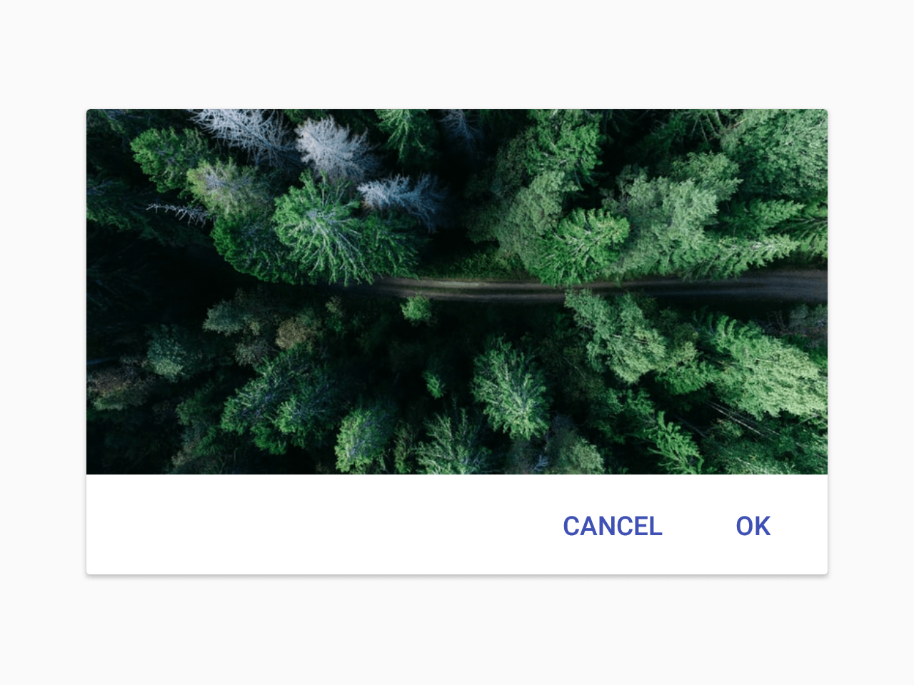
<Card>
<Card.Title title="Card Title" subtitle="Card Subtitle" left={LeftContent} />
<Card.Content>
<Title>Card title</Title>
<Paragraph>Card content</Paragraph>
</Card.Content>
<Card.Cover source={{ uri: 'https://picsum.photos/700' }} />
<Card.Actions>
<Button>Cancel</Button>
<Button>Ok</Button>
</Card.Actions>
</Card>
);
export default MyComponent;Props
styleType:
StyleProp<ViewStyle>themeType:
ThemeStatic properties
These properties can be accessed on Card by using the dot notation, e.g. Card.Content.
ContentType:
staticActionsType:
staticCoverType:
staticTitleType:
static