Modal
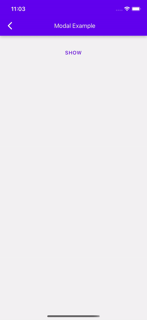
The Modal component is a simple way to present content above an enclosing view.
To render the Modal above other components, you'll need to wrap it with the Portal component.
Usage
import * as React from 'react';
import { Modal, Portal, Text, Button, Provider } from 'react-native-paper';

const MyComponent = () => {
  const [visible, setVisible] = React.useState(false);

  const showModal = () => setVisible(true);

  const hideModal = () => setVisible(false);

  return (
    <Provider>
      <Portal>
        <Modal visible={visible} onDismiss={hideModal}>
          <Text>Example Modal</Text>
        </Modal>
        <Button style={{marginTop: 30}} onPress={showModal}>
          Show
        </Button>
      </Portal>
    </Provider>
  );
};

export default MyComponent;
Props
dismissableType:
booleanDefault value:
trueDetermines whether clicking outside the modal dismiss it.
themeType:
Theme