Appbar
A component to display action items in a bar. It can be placed at the top or bottom. The top bar usually contains the screen title, controls such as navigation buttons, menu button etc. The bottom bar usually provides access to a drawer and up to four actions.
Usage
import * as React from 'react';
import { Appbar } from 'react-native-paper';
import { StyleSheet } from 'react-native';
export default class MyComponent extends React.Component {
render() {
return (
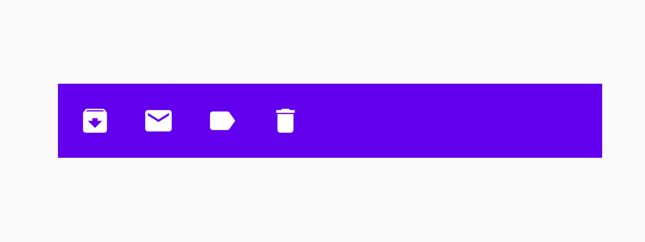
<Appbar style={styles.bottom}>
<Appbar.Action icon="archive" onPress={() => console.log('Pressed archive')} />
<Appbar.Action icon="mail" onPress={() => console.log('Pressed mail')} />
<Appbar.Action icon="label" onPress={() => console.log('Pressed label')} />
<Appbar.Action icon="delete" onPress={() => console.log('Pressed delete')} />
</Appbar>
);
}
}
const styles = StyleSheet.create({
bottom: {
position: 'absolute',
left: 0,
right: 0,
bottom: 0,
},
});Props
darkType:
booleanWhether the background color is a dark color. A dark appbar will render light text and vice-versa.
themeType:
ThemestyleType:
anyStatic properties
These properties can be accessed on Appbar by using the dot notation, e.g. Appbar.Content.