TextInput
A component to allow users to input text.
Usage
import * as React from 'react';
import { TextInput } from 'react-native-paper';

export default class MyComponent extends React.Component {
  state = {
    text: ''
  };

  render(){
    return (
      <TextInput
        label='Email'
        value={this.state.text}
        onChangeText={text => this.setState({ text })}
      />
    );
  }
}
Props
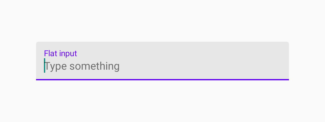
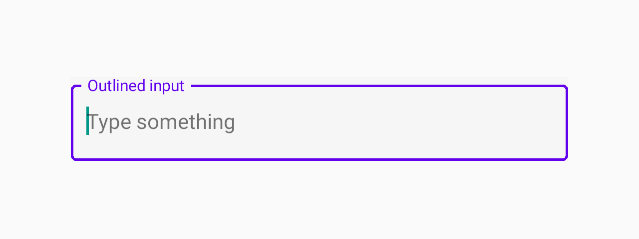
mode'flat' | 'outlined''flat'Mode of the TextInput.
flat- flat input with an underline.outlined- input with an outline.
In outlined mode, the background color of the label is derived from colors.background in theme or the backgroundColor style.
This component render TextInputOutlined or TextInputFlat based on that props
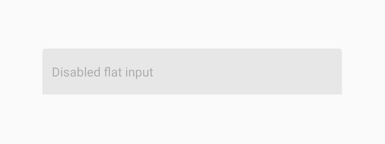
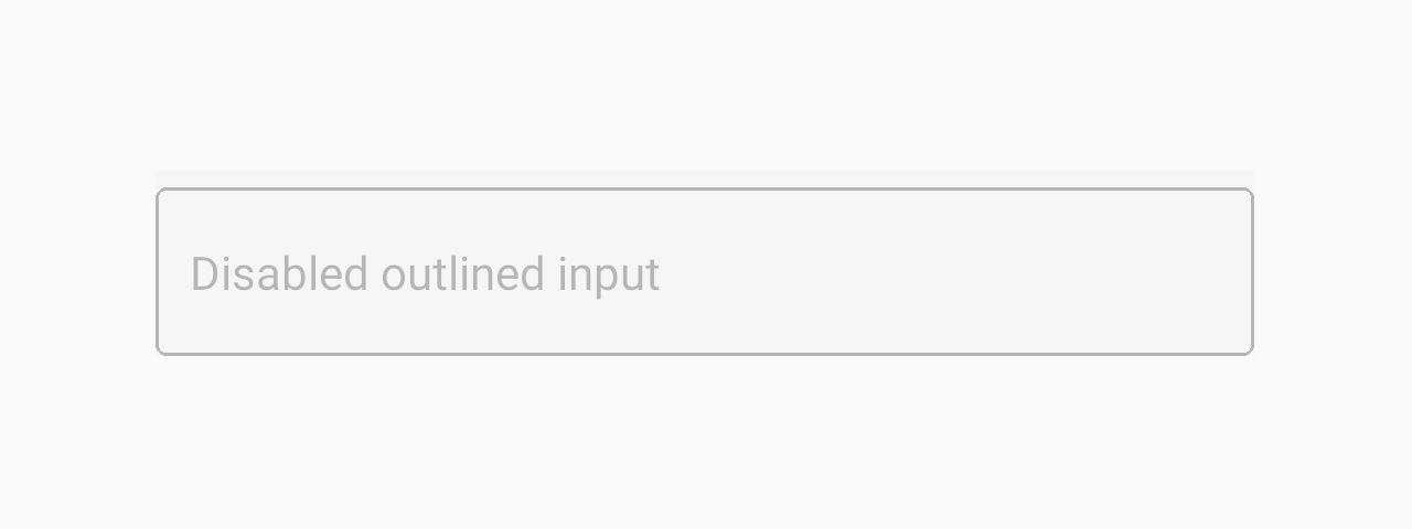
disabledbooleanfalseIf true, user won't be able to interact with the component.
onChangeTextFunctionCallback that is called when the text input's text changes. Changed text is passed as an argument to the callback handler.
render(props: RenderProps) => React.Node(props: RenderProps) => <NativeTextInput {...props} />Callback to render a custom input component such as react-native-text-input-mask
instead of the default TextInput component from react-native.
Example:
<TextInput
  label="Phone number"
  render={props =>
    <TextInputMask
      {...props}
      mask="+[00] [000] [000] [000]"
    />
  }
/>styleanythemeThemeeditabletrue...TextInput propsMethods
These methods can be accessed on the ref of the component, e.g. textInputRef.isFocused(...args).
isFocusedReturns true if the input is currently focused, false otherwise.
clearRemoves all text from the TextInput.
focusFocuses the input.
blurRemoves focus from the input.