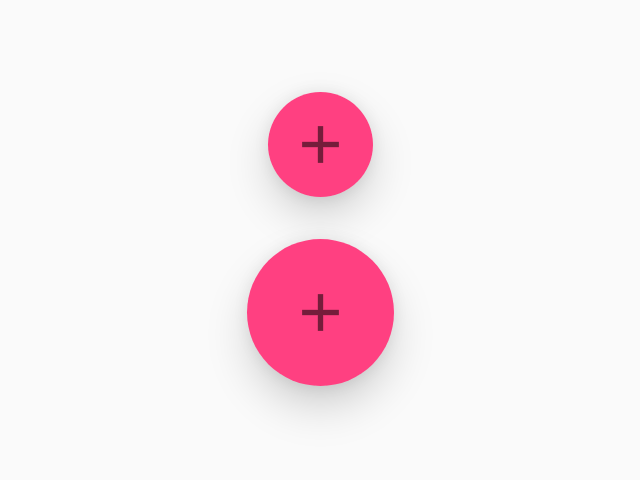
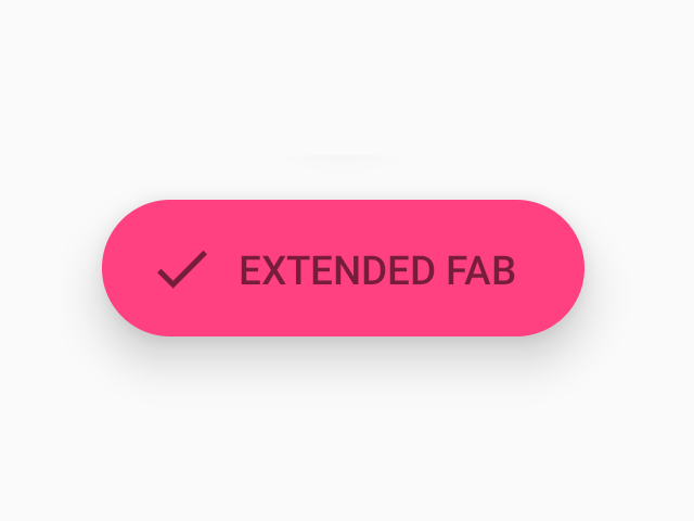
FAB
A floating action button represents the primary action in an application.
Usage
import * as React from 'react';
import { StyleSheet } from 'react-native';
import { FAB } from 'react-native-paper';

const MyComponent = () => (
  <FAB
    style={styles.fab}
    small
    icon="add"
    onPress={() => console.log('Pressed')}
  />
);

const styles = StyleSheet.create({
  fab: {
    position: 'absolute',
    margin: 16,
    right: 0,
    bottom: 0,
  },
})

export default MyComponent;
Props
accessibilityLabelType:
stringAccessibility label for the FAB. This is read by the screen reader when the user taps the FAB.
Uses label by default if specified.
smallType:
booleanWhether FAB is mini-sized, used to create visual continuity with other elements. This has no effect if label is specified.
disabledType:
booleanWhether FAB is disabled. A disabled button is greyed out and onPress is not called on touch.
styleType:
anythemeType:
ThemeStatic properties
These properties can be accessed on FAB by using the dot notation, e.g. FAB.Group.