FAB.Group
A component to display a stack of FABs with related actions in a speed dial.
To render the group above other components, you'll need to wrap it with the Portal component.
Usage
import * as React from 'react';
import { FAB, Portal } from 'react-native-paper';
export default class MyComponent extends React.Component {
state = {
open: false,
};
render() {
return (
<Portal>
<FAB.Group
open={this.state.open}
icon={this.state.open ? 'today' : 'add'}
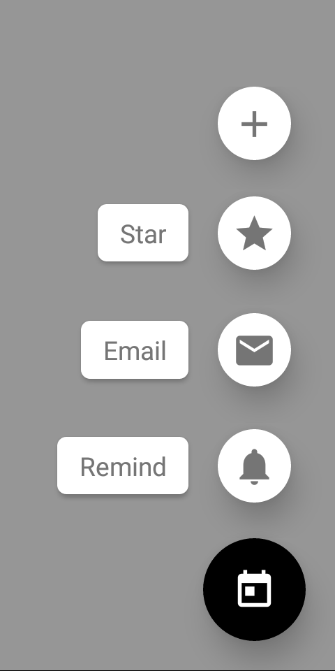
actions={[
{ icon: 'add', onPress: () => console.log('Pressed add') },
{ icon: 'star', label: 'Star', onPress: () => console.log('Pressed star')},
{ icon: 'email', label: 'Email', onPress: () => console.log('Pressed email') },
{ icon: 'notifications', label: 'Remind', onPress: () => console.log('Pressed notifications') },
]}
onStateChange={({ open }) => this.setState({ open })}
onPress={() => {
if (this.state.open) {
// do something if the speed dial is open
}
}}
/>
</Portal>
);
}
}Props
actions (required)Array<{
icon: IconSource,
label?: string,
color?: string,
accessibilityLabel?: string,
style?: any,
onPress: () => mixed,
}>Action items to display in the form of a speed dial. An action item should contain the following properties:
icon: icon to display (required)label: optional label textaccessibilityLabel: accessibility label for the action, uses label by default if specifiedcolor: custom icon color of the action itemstyle: pass additional styles for the fab item, for example,backgroundColoronPress: callback that is called whenFABis pressed (required)
icon (required)IconSourceIcon to display for the FAB.
You can toggle it based on whether the speed dial is open to display a different icon.
accessibilityLabelstringAccessibility label for the FAB. This is read by the screen reader when the user taps the FAB.
onStateChange (required)(state: { open: boolean }) => mixedCallback which is called on opening and closing the speed dial. The open state needs to be updated when it's called, otherwise the change is dropped.
styleanyStyle for the group. You can use it to pass additional styles if you need. For example, you can set an additional padding if you have a tab bar at the bottom.
fabStyleanyStyle for the FAB. It allows to pass the FAB button styles, such as backgroundColor.
themeTheme