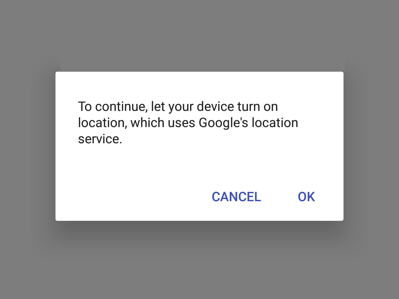
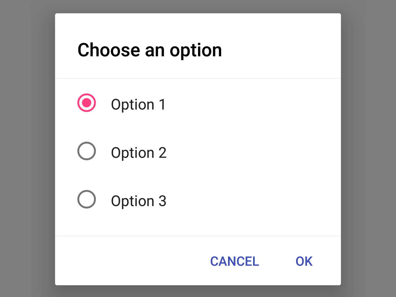
Dialog
Dialogs inform users about a specific task and may contain critical information, require decisions, or involve multiple tasks.
To render the Dialog above other components, you'll need to wrap it with the Portal component.
Usage
import * as React from 'react';
import { View } from 'react-native';
import { Button, Paragraph, Dialog, Portal } from 'react-native-paper';

export default class MyComponent extends React.Component {
  state = {
    visible: false,
  };

  _showDialog = () => this.setState({ visible: true });

  _hideDialog = () => this.setState({ visible: false });

  render() {
    return (
      <View>
        <Button onPress={this._showDialog}>Show Dialog</Button>
        <Portal>
          <Dialog
             visible={this.state.visible}
             onDismiss={this._hideDialog}>
            <Dialog.Title>Alert</Dialog.Title>
            <Dialog.Content>
              <Paragraph>This is simple dialog</Paragraph>
            </Dialog.Content>
            <Dialog.Actions>
              <Button onPress={this._hideDialog}>Done</Button>
            </Dialog.Actions>
          </Dialog>
        </Portal>
      </View>
    );
  }
}
Props
dismissableType:
booleanDefault value:
trueDetermines whether clicking outside the dialog dismiss it.
styleType:
anythemeType:
ThemeStatic properties
These properties can be accessed on Dialog by using the dot notation, e.g. Dialog.Content.