Menu
Menus display a list of choices on temporary elevated surfaces. Their placement varies based on the element that opens them.
Usage
import * as React from 'react';
import { View } from 'react-native';
import { Button, Paragraph, Menu, Divider, Provider } from 'react-native-paper';
export default class MyComponent extends React.Component {
state = {
visible: false,
};
_openMenu = () => this.setState({ visible: true });
_closeMenu = () => this.setState({ visible: false });
render() {
return (
<Provider>
<View
style={{
paddingTop: 50,
flexDirection: 'row',
justifyContent: 'center'
}}>
<Menu
visible={this.state.visible}
onDismiss={this._closeMenu}
anchor={
<Button onPress={this._openMenu}>Show menu</Button>
}
>
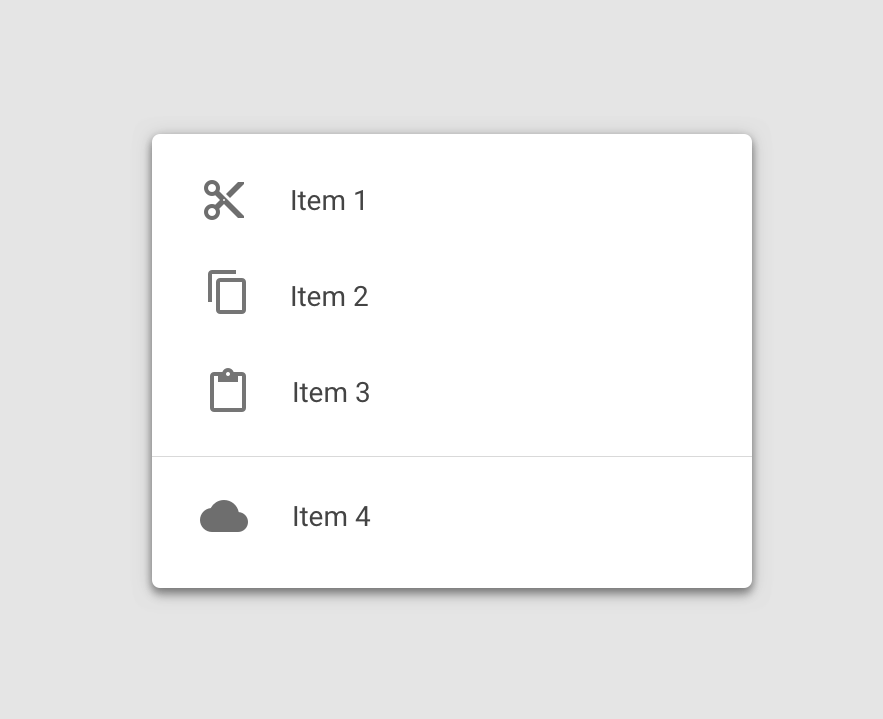
<Menu.Item onPress={() => {}} title="Item 1" />
<Menu.Item onPress={() => {}} title="Item 2" />
<Divider />
<Menu.Item onPress={() => {}} title="Item 3" />
</Menu>
</View>
</Provider>
);
}
}Props
anchor (required)Type:
React.NodeThe anchor to open the menu from. In most cases, it will be a button that opens the manu.
statusBarHeightType:
numberDefault value:
APPROX_STATUSBAR_HEIGHTExtra margin to add at the top of the menu to account for translucent status bar on Android.
If you are using Expo, we assume translucent status bar and set a height for status bar automatically.
Pass 0 or a custom value to and customize it.
This is automatically handled on iOS.
onDismiss (required)Type:
() => mixedCallback called when Menu is dismissed. The visible prop needs to be updated when this is called.
styleType:
anythemeType:
ThemeStatic properties
These properties can be accessed on Menu by using the dot notation, e.g. Menu.Item.