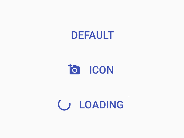
Button
A button is component that the user can press to trigger an action.

Usage
import * as React from 'react';
import { Button } from 'react-native-paper';
const MyComponent = () => (
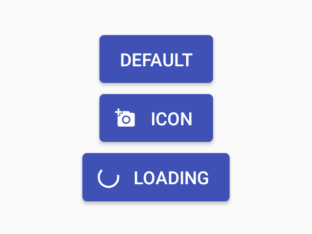
<Button icon="add-a-photo" mode="contained" onPress={() => console.log('Pressed')}>
Press me
</Button>
);
export default MyComponent;Props
modeType:
'text' | 'outlined' | 'contained'Default value:
'text'Mode of the button. You can change the mode to adjust the styling to give it desired emphasis.
text- flat button without background or outline (low emphasis)outlined- button with an outline (medium emphasis)contained- button with a background color and elevation shadow (high emphasis)
darkType:
booleanWhether the color is a dark color. A dark button will render light text and vice-versa. Only applicable for contained mode.
disabledType:
booleanWhether the button is disabled. A disabled button is greyed out and onPress is not called on touch.
uppercaseType:
booleanDefault value:
trueMake the label text uppercased. Note that this won't work if you pass React elements as children.
accessibilityLabelType:
stringAccessibility label for the button. This is read by the screen reader when the user taps the button.
contentStyleType:
anyStyle of button's inner content. Use this prop to apply custom height and width.
styleType:
anythemeType:
Theme