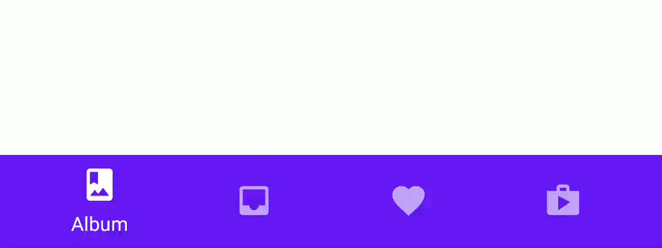
BottomNavigation
Bottom navigation provides quick navigation between top-level views of an app with a bottom navigation bar. It is primarily designed for use on mobile.
For integration with React Navigation, you can use react-navigation-material-bottom-tab-navigator.
Usage
import * as React from 'react';
import { BottomNavigation, Text } from 'react-native-paper';

const MusicRoute = () => <Text>Music</Text>;

const AlbumsRoute = () => <Text>Albums</Text>;

const RecentsRoute = () => <Text>Recents</Text>;

export default class MyComponent extends React.Component {
  state = {
    index: 0,
    routes: [
      { key: 'music', title: 'Music', icon: 'queue-music' },
      { key: 'albums', title: 'Albums', icon: 'album' },
      { key: 'recents', title: 'Recents', icon: 'history' },
    ],
  };

  _handleIndexChange = index => this.setState({ index });

  _renderScene = BottomNavigation.SceneMap({
    music: MusicRoute,
    albums: AlbumsRoute,
    recents: RecentsRoute,
  });

  render() {
    return (
      <BottomNavigation
        navigationState={this.state}
        onIndexChange={this._handleIndexChange}
        renderScene={this._renderScene}
      />
    );
  }
}
Props
shiftingbooleanWhether the shifting style is used, the active tab appears wider and the inactive tabs won't have a label.
By default, this is true when you have more than 3 tabs.
labeledbooleantrueWhether to show labels in tabs. When false, only icons will be displayed.
navigationState (required){
index: number,
routes: Array<T>,
}State for the bottom navigation. The state should contain the following properties:
index: a number reprsenting the index of the active route in theroutesarrayroutes: an array containing a list of route objects used for rendering the tabs
Each route object should contain the following properties:
key: a unique key to identify the route (required)title: title of the route to use as the tab labelicon: icon to use as the tab icon, can be a string, an image source or a react componentcolor: color to use as background color for shifting bottom navigationbadge: badge to show on the tab icon, can betrueto show a dot,stringornumberto show text.accessibilityLabel: accessibility label for the tab buttontestID: test id for the tab button
Example:
{
  index: 1,
  routes: [
    { key: 'music', title: 'Music', icon: 'queue-music', color: '#3F51B5' },
    { key: 'albums', title: 'Albums', icon: 'album', color: '#009688' },
    { key: 'recents', title: 'Recents', icon: 'history', color: '#795548' },
    { key: 'purchased', title: 'Purchased', icon: 'shopping-cart', color: '#607D8B' },
  ]
}
BottomNavigation is a controlled component, which means the index needs to be updated via the onIndexChange callback.
onIndexChange (required)(index: number) => mixedCallback which is called on tab change, receives the index of the new tab as argument. The navigation state needs to be updated when it's called, otherwise the change is dropped.
renderScene (required)(props: {
route: T,
jumpTo: (key: string) => mixed,
}) => ?React.NodeCallback which returns a react element to render as the page for the tab. Receives an object containing the route as the argument:
renderScene = ({ route, jumpTo }) => {
  switch (route.key) {
    case 'music':
      return <MusicRoute jumpTo={jumpTo} />;
    case 'albums':
      return <AlbumsRoute jumpTo={jumpTo} />;
  }
}
Pages are lazily rendered, which means that a page will be rendered the first time you navigate to it. After initial render, all the pages stay rendered to preserve their state.
You need to make sure that your individual routes implement a shouldComponentUpdate to improve the performance.
To make it easier to specify the components, you can use the SceneMap helper:
renderScene = BottomNavigation.SceneMap({
  music: MusicRoute,
  albums: AlbumsRoute,
});
Specifying the components this way is easier and takes care of implementing a shouldComponentUpdate method.
Each component will receive the current route and a jumpTo method as it's props.
The jumpTo method can be used to navigate to other tabs programmatically:
this.props.jumpTo('albums')renderIcon(props: {
route: T,
focused: boolean,
color: string,
}) => React.NodeCallback which returns a React Element to be used as tab icon.
renderLabel(props: {
route: T,
focused: boolean,
color: string,
}) => React.NodeCallback which React Element to be used as tab label.
getLabelText(props: { route: T }) => stringGet label text for the tab, uses route.title by default. Use renderLabel to replace label component.
getAccessibilityLabel(props: { route: T }) => ?stringGet accessibility label for the tab button. This is read by the screen reader when the user taps the tab.
Uses route.accessibilityLabel by default.
getTestID(props: { route: T }) => ?stringGet the id to locate this tab button in tests, uses route.testID by default.
getBadge(props: { route: T }) => boolean | number | stringGet badge for the tab, uses route.badge by default.
getColor(props: { route: T }) => string/**
Get color for the tab, uses route.color by default.
onTabPress(props: { route: T }) => mixedFunction to execute on tab press. It receives the route for the pressed tab, useful for things like scroll to top.
keyboardHidesNavigationBarbooleantrueWhether the bottom navigation bar is hidden when keyboard is shown.
On Android, this works best when windowSoftInputMode is set to adjustResize.
barStyleanyStyle for the bottom navigation bar. You can set a bottom padding here if you have a translucent navigation bar on Android:
barStyle={{ paddingBottom: 48 }}styleanythemeThemeStatic properties
These properties can be accessed on BottomNavigation by using the dot notation, e.g. BottomNavigation.SceneMap.
SceneMapFunctionscenes: {
[key: string]: React.ComponentType<{
route: T,
jumpTo: (key: string) => mixed,
}>,
}Function which takes a map of route keys to components. Pure components are used to minmize re-rendering of the pages. This drastically improves the animation performance.