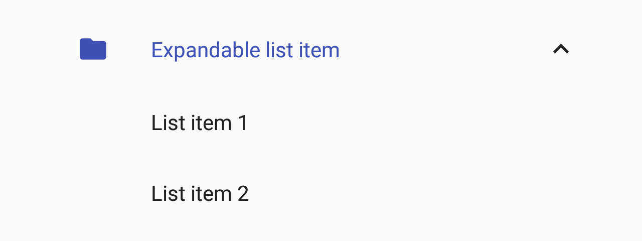
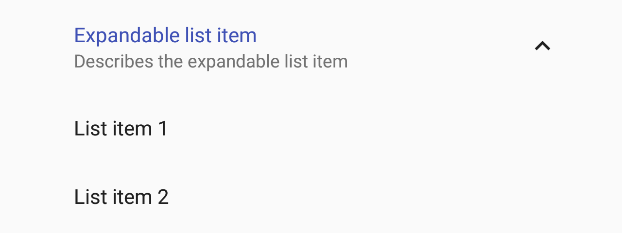
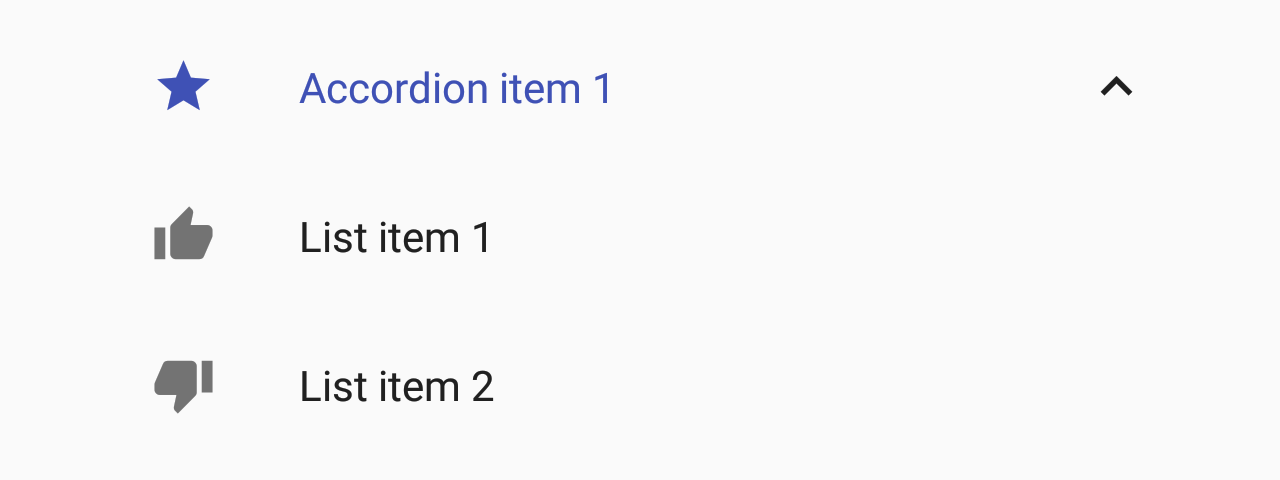
List.Accordion
A component used to display an expandable list item.
Usage
import * as React from 'react';
import { List, Checkbox } from 'react-native-paper';

class MyComponent extends React.Component {
  state = {
    expanded: true
  }

  _handlePress = () =>
    this.setState({
      expanded: !this.state.expanded
    });

  render() {
    return (
      <List.Section title="Accordions">
        <List.Accordion
          title="Uncontrolled Accordion"
          left={props => <List.Icon {...props} icon="folder" />}
        >
          <List.Item title="First item" />
          <List.Item title="Second item" />
        </List.Accordion>

        <List.Accordion
          title="Controlled Accordion"
          left={props => <List.Icon {...props} icon="folder" />}
          expanded={this.state.expanded}
          onPress={this._handlePress}
        >
          <List.Item title="First item" />
          <List.Item title="Second item" />
        </List.Accordion>
      </List.Section>
    );
  }
}

export default MyComponent;
Props
leftType:
(props: { color: string }) => React.NodeCallback which returns a React element to display on the left side.
expandedType:
booleanWhether the accordion is expanded
If this prop is provided, the accordion will behave as a "controlled component".
You'll need to update this prop when you want to toggle the component or on onPress.
themeType:
Theme