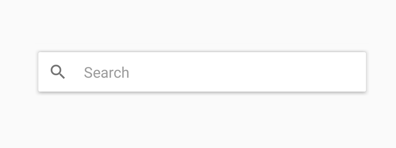
Searchbar
Searchbar is a simple input box where users can type search queries.
Usage
import * as React from 'react';
import { Searchbar } from 'react-native-paper';

export default class MyComponent extends React.Component {
  state = {
    firstQuery: '',
  };

  render() {
    const { firstQuery } = this.state;
    return (
      <Searchbar
        placeholder="Search"
        onChangeText={query => { this.setState({ firstQuery: query }); }}
        value={firstQuery}
      />
    );
  }
}
Props
onChangeTextType:
(query: string) => voidCallback that is called when the text input's text changes.
styleType:
anythemeType:
ThemeMethods
These methods can be accessed on the ref of the component, e.g. searchbarRef.isFocused(...args).
isFocusedReturns true if the input is currently focused, false otherwise.
clearRemoves all text from the TextInput.
focusFocuses the input.
blurRemoves focus from the input.