Avatar
Avatar component.
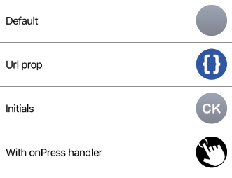
Example usage:
import { Avatar } from 'react-native-ios-kit';
<Avatar initials="CK" size={30} />
Props
initials (optional)
type: string
String to be displayed inside Avatar.
default value: ''
onPress (optional)
type: void => void
onPress event handler.
size (optional)
type: number
Size of an Avatar.
style (optional)
type: Object
Custom styles to apply to Avatar.
theme (optional)
type: Theme
Custom theme for component. By default provided by the ThemeProvider.
url (optional)
type: string
Url pointing to remote avatar image.