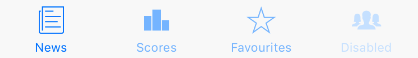
TabBar
Example usage:
import { TabBar } from 'react-native-ios-kit';
<TabBar
tabs={[
{
icon: 'ios-paper-outline',
title: 'News',
onPress: this.selectTab,
isActive: this.state.activeTab === 0,
},
{
icon: 'ios-podium',
title: 'Scores',
onPress: this.selectTab,
isActive: this.state.activeTab === 1,
},
{
icon: 'ios-star-outline',
title: 'Favorites',
onPress: this.selectTab,
isActive: this.state.activeTab === 2,
},
{
icon: 'ios-people',
title: 'Disabled',
onPress: this.selectTab,
isActive: this.state.activeTab === 3,
disabled: true,
},
]}
/>
Theme
Uses following theme properties:
barColor- background colordividerColor- top border colorprimaryColor- icon color and caption color for active tabdisabledColor- icon color and caption color for disabled tabprimaryLightColor- icon color and caption color for non active tab
Props
theme (optional)
type: Theme
Custom theme for component. By default provided by the ThemeProvider.
tabs
type: Array<TabItem>
Array of Tabs. Each TabItem needs to have below shape:
icon: Icon name (optional)title: string(optional)onPress: function- to be called when Tab is tappedisActive: boolean(optional) - indicating whether Tab is activedisabled?: boolean(optional) - disables a Tab