TableView
A basic TableView component that can render iOS table view.
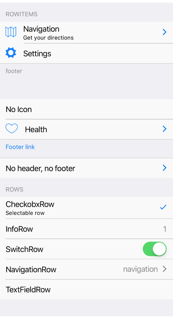
It renders header, footer and children which can be RowItem components.
Example usage:
import { ScrollView, TableView } from 'react-native-ios-kit';
<ScrollView>
<TableView header="Header" footer="footer...">
<RowItem
icon="ios-map-outline"
title="Navigation"
/>
<RowItem
icon="ios-settings"
title="Settings"
/>
</TableView>
<TableView footer="PrivacyPolicy" onFooterPress={() => alert('Hello')}>
<RowItem title="No Icon" />
</TableView>
</ScrollView>
TableView rows
There are few ready for use row components:
RowItem- basic row itemInfoRow- row with simple textCheckboxRow- row with checkboxNavigationRow- row for navigationSwitchRow- row with switchTextFieldRow- row with text field
Theme
Uses following theme properties:
footnoteBackgroundColor- background color of header and footerfootnoteColor- text color of header and footerprimaryColor- text color of footer if there isonFooterPressprop
Props
children
type: React.ChildrenArray<*>
Children of TableView. Could be RowItem components.
footer (optional)
type: string
Footer text of TableView
footerStyle (optional)
type: Object
Custom footer style.
header (optional)
type: string
Header text of TableView.
headerStyle (optional)
type: Object
Custom styles for header.
onFooterPress (optional)
type: () => void
Invoked on footer press.
theme (optional)
type: Theme
Custom theme for component. By default provided by the ThemeProvider.
withoutHeader (optional)
type: boolean
Indicates whether render empty header or not. If true it won't render header.
withoutFooter (optional)
type: boolean
Whether render empty footer or not. If true it won't render footer.