Toolbar
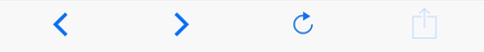
Just like TabBar, the Toolbar component appears on the bottom of the application screen. Instead of switching between different views, it allows you to perform actions within the current view, e.g. share or refresh. The Toolbar displays a list of icons or text buttons.
Example usage:
import { Toolbar } from 'react-native-ios-kit';
<Toolbar
items={[
{
icon: 'ios-arrow-back',
onPress: this.runAction,
},
{
icon: 'ios-arrow-forward',
onPress: this.runAction,
},
{
icon: 'ios-refresh',
onPress: this.runAction,
},
{
icon: 'ios-share-outline',
onPress: this.runAction,
disabled: true,
},
]}
/>
Theme
Uses following theme properties:
barColor- background colordividerColor- top border colorprimaryColor- icon color and caption color for active itemdisabledColor- icon color and caption color for disabled item
Props
theme (optional)
type: Theme
Custom theme for component. By default provided by the ThemeProvider.
items
type: Array<ToolbarItem>
Array of Items. Each ToolbarItem needs to have below shape:
icon: Icon name (optional)title: string(optional)onPress: function- to be called when Item is tappeddisabled?: boolean(optional) - disables an Item