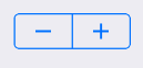
Stepper
Two-segment control used to increase or decrease an incremental value.
Example usage:
import { Stepper } from 'react-native-ios-kit';
<Stepper
value={this.state.value}
onValueChange={value => this.setState({ value })}
minValue={0}
maxValue={10}
/>
Theme
Uses following theme properties:
primaryColor- Stepper borders and Icon colorprimaryLightColor- pressed in background color, inactive color of Stepper button
Props
maxValue (optional)
type: number
default value: 100
The highest possible numeric value for the stepper.
minValue (optional)
type: number
default value: 0
The lowest possible numeric value for the stepper.
onValueChange
type: (counter: number) => void
Callback function on changing counter result
step (optional)
type: number
default value: 1
The step, or increment, value for the stepper.
theme (optional)
type: Theme
Custom theme for component. By default provided by the ThemeProvider.
value
type: number
The numeric value of the stepper.