RowItem
A component you can use as a children for TableView.
Example usage:
import { RowItem } from 'react-native-ios-kit';
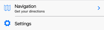
<RowItem
icon="ios-map-outline"
title="Navigation"
subtitle="Get your directions"
rightComponent={ArrowRight}
onPress={() => alert('Hello')}
/>
<RowItem
icon="ios-map-outline"
title="Navigation"
subtitle="Get your directions"
renderRight={() => <ArrowRight />}
onPress={() => alert('Hello')}
/>
Theme
Uses following theme properties:
barColor- background colorfootnoteColor- underline colorprimaryColor- icon color
Props
icon (optional)
type: ImageSource
ImageSource. See 'Icon`
onPress (optional)
type: () => void
Invoked on RowItem's onPress event.
renderRight (optional)
type: () => React.Element<*>
Function which should return Element to be displayed on the right side of row.
It can be use interchangeably with rightComponent prop.
rightComponent (optional)
type: React.ComponentType<*>
Component to be displayed on the right side of row. It can be use interchangeably with renderRight prop.
subtitle (optional)
type: string
Subtitle text to be displayed.
theme (optional)
type: Theme
Custom theme for component. By default provided by the ThemeProvider.
title (optional)
type: string
Title text to be displayed.