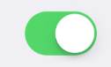
Switch
A basic Switch component that should render native iOS switch.
Example usage:
import { Switch } from 'react-native-ios-kit';
<Switch
value={this.state.switchValue}
onValueChange={value => this.setState({ switchValue: value })}
/>
Theme
Uses following theme properties:
positiveColor- selected switch background color (trackColor)
Props
disabled (optional)
type: boolean
If true, disable all interactions for this component.
onValueChange (optional)
type: (value: boolean) => *
Invoked with the new value when the value changes.
trackColor (optional)
type: string
default value: positiveColor from theme
Background color when the switch is turned on.
style (optional)
type: Object
Switch style.
theme (optional)
type: Theme
Custom theme for component. By default provided by the ThemeProvider.
thumbTintColor (optional)
type: string
Color of the foreground switch grip.
tintColor (optional)
type: string
Border color when the switch is turned off.
value (optional)
type: boolean
Switch value.