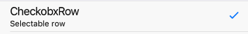
CheckboxRow
RowItem with Checkmark Icon on right side.
Example usage:
import { CheckboxRow } from 'react-native-ios-kit';
<CheckboxRow
selected={this.state.checkboxSelected}
onPress={() =>
this.setState(state => ({
checkboxSelected: !state.checkboxSelected,
}))
}
title="CheckboxRow"
subtitle="Selectable row"
/>
Theme
Uses following theme properties:
primaryColor- checkmark icon color
Props
RowItem props...
Other props accepted by RowItem component.
onPress
type: void => void
Event fired when Row is pressed in.
selected
type: boolean
Indicates whether checkbox is selected or not.
theme (optional)
type: Theme
Custom theme for component. By default provided by the ThemeProvider.