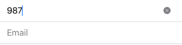
TextField
Single-line, fixed-height field, that automatically brings up a keyboard when the user taps it. Used to request a small amount of information, such as an email address.
Example usage:
import { TextField } from 'react-native-ios-kit';
<TextField
placeholder={'Phone number'}
value={this.state.phone}
onValueChange={text => this.setState({ phone: text })}
/>
Theme
Uses following theme properties:
backgroundColor- background colordividerColor- color of bottom borderplaceholderColor- placeholder colorprimaryColor- pointer and selectionColortextColor- text color
Props
TextInput props...
Other props accepted by TextInput component.
containerStyle (optional)
type: ViewStyleProp
Style of TextField's wrapper container
inputStyle (optional)
type: ViewStyleProp
Style of TextField's input
onValueChange
type: (text: string) => void
Invoked with the new value when the value of text input changes.
placeholder
type string
Placeholder value
theme
type: Theme
Custom theme for component. By default provided by the ThemeProvider.
value
type: string
Value of TextInput
clearButton
type boolean
Display the custom button to clear the input. By default the button is shown.