Button
A basic Button component.
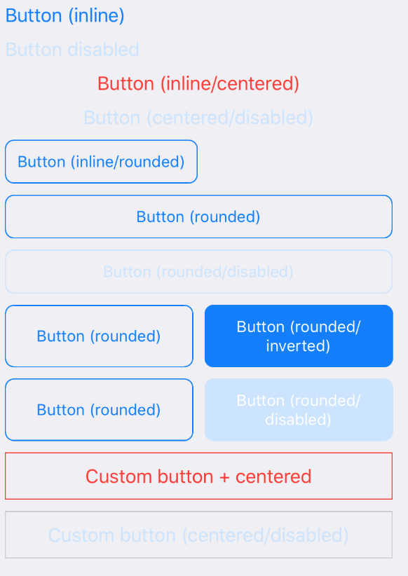
Example usage:
Theme
Uses following theme properties:
primaryColor- text color, border color and background color if inverteddisabledColor- for disabled button text color, border color and background color if inverted
Props
centered (optional)
type: boolean
If true, center text inside the button. Applies only if rounded prop is not true.
children (optional)
type: React.Element<*> | React.Element<*>[] | string
color (optional)
type: string
Custom font color.
disabled (optional)
type: boolean
If true, disable all interactions for this component.
disabledStyle (optional)
type: Object
Custom styles to apply to the button.
inline (optional)
type: boolean
If true, disable automatic horizontal resize. The button will only occupy width it needs, instead of 100%.
innerStyle (optional)
type: Object
Custom styles to apply to text inside the button.
inverted (optional)
type: boolean
If true, invert font color with background color. Applies only if rounded prop is true.
onPress (optional)
type: () => void
Handler to be called when the user taps the button.
onPressIn (optional)
type: () => void
Called as soon as the touchable element is pressed and invoked even before onPress.
onPressOut (optional)
type: () => void
Called as soon as the touch is released even before onPress.
onLongPress (optional)
type: () => void
Called on a long press.
rounded (optional)
type: boolean
If true, make border corners rounded.
style (optional)
type: Object
Custom styles to apply to the button.
theme (optional)
type: Theme
Custom theme for component. By default provided by the ThemeProvider.
testID (optional)
type: string
Used to locate the item in end-to-end tests.