PageControl
PageControl component shows the position of the current page in a flat list of pages.
Example usage:
import { PageControl } from 'react-native-ios-kit';
<PageControl
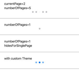
currentPage={currentPage}
numberOfPages={5}
updateCurrentPageDisplay={currentPage =>
this.setState({ currentPage })
}
/>
Theme
Uses following theme properties:
barColor- current page indicator tint colordividerColor- page indicator tint color
Props
currentPage
type: number
Selected pages index.
currentPageIndicatorTintColor (optional),
type: string
default value: barColor from theme
hidesForSinglePage (optional)
type: boolean
default value: false
A Boolean value that controls whether the page control is hidden when there is only one page.
numberOfPages
type: number
The number of pages the receiver shows (as dots).
pageIndicatorTintColor (optional)
type: string
default value: dividerColor from theme
size (optional)
type: number
default value: 8
Size of the controls.
theme (optional)
type: Theme
Custom theme for component. By default provided by the ThemeProvider.
updateCurrentPageDisplay
type: number => void
Callback function to be fired when user taps controls.