Typography
Basic typography components.
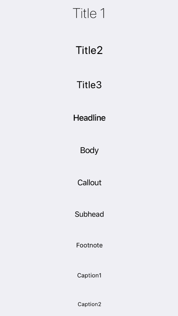
Example usage:
<Title1>Title 1</Title1>
<Title2>Title2</Title2>
<Title3>Title3</Title3>
<Headline>Headline</Headline>
<Body>Body</Body>
<Callout>Callout</Callout>
<Subhead>Subhead</Subhead>
<Footnote>Footnote</Footnote>
<Caption1>Caption1</Caption1>
<Caption2>Caption2</Caption2>
Typography Components:
Title1Title2Title3HeadlineBodyCalloutSubheadFootnoteCaption1Caption2
Theme
Uses following theme properties:
textColor- color of text
Props of every typography component
style (optional)
type: Object
Custom styles to apply to the typography component.
theme (optional)
type: Theme
Custom theme for component. By default provided by the ThemeProvider.