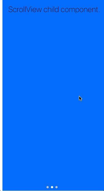
PageControlView
PageControlView swipeable view with PageControls at the bottom of the screen.
Example usage:
import { PageControlView } from 'react-native-ios-kit';
<PageControlView defaultPage={1}>
<View style={styles.container}>
<Title1>First page.</Title1>
</View>
<View style={styles.container}>
<Title1>Second page.</Title1>
</View>
<View style={styles.container}>
<Title1>Third page.</Title1>
</View>
</PageControlView>
Theme
PageControl uses following theme properties:
barColor- current page indicator tint colordividerColor- page indicator tint color
Props
children
type: React.Node
Children of PageControlView, each one to be displayed as a separate page.
containerStyle (optional)
type: ViewStyleProp
Style of wrapper container.
currentPageIndicatorTintColor (optional),
type: string
default value: barColor from theme
onPageChange (optional)
type: number => void
Event handler called when current page changes
pageIndicatorTintColor (optional)
type: string
default value: dividerColor from theme
pageIndicatorSize (optional)
type: number
default value: 8
Size of the controls.
startPage (optional)
type:: number
default value: 0
theme (optional)
type: Theme
Custom theme for component. By default provided by the ThemeProvider.