SegmentedControl
Linear set of two or more segments, each of which functions as a mutually exclusive button.
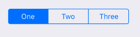
Example usage:
import { SegmentedControl } from 'react-native-ios-kit';
<SegmentedControl
values={['One', 'Two', 'Three']}
selectedIndex={this.state.selectedIndex}
onValueChange={(value, index) =>
this.setState({
selectedValue: value,
selectedIndex: index
})
}
style={{ width: 222, alignSelf: 'center' }}
/>
Theme
Uses following theme properties:
primaryColor- SegmentedControl'stintColor
Props
onValueChange
type: (value: string, index: number) => void
Callback that is called when the user taps a segment. Passes the segment's value and index as arguments.
selectedIndex
type: number
Index of currently selected value.
theme (optional)
type: Theme
Custom theme for component. By default provided by the ThemeProvider.
tintColor (optional)
type: string
default value: primaryColor from theme
Accent color of SegmentedControl.
values
type: Array<string>
Labels of the control's segment buttons.