Collection
A Collection manages an ordered set of content, such as a set of photos, and presents it in a customizable and highly visual layout.
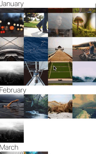
Example usage:
Theme
Uses following theme properties:
footnoteColor- tintColor of RefreshControl component.
Props
contentContainerStyle (optional)
type: ViewStyleProp
Styles to be applied to the section list view content container.
data
type: Array
An array of items to be rendered.
keyExtractor (optional)
type: (item: *, index: number) => string
default value: (item, index) => `${item.key}` || `${index}`
Function used to extract a unique key for each item rendered.
listStyle (optional)
type: ViewStyleProp
Styles of underlying SectionList container
numberOfColumns (optional)
type: number
default value 4
Number of columns to be displayed in a row.
onEndReached (optional)
type: (info: { distanceFromEnd: number }) => void
Called once when the scroll position gets within onEndReachedThreshold of the rendered content.
onEndReachedThreshold (optional)
type: number
Distance from end of the list to invoke onEndReached function.
onRefresh (optional)
type: () => void
Function called once user pulls to refresh. Must be used in conjunction with refreshing prop.
refreshing (optional)
type: boolean
Boolean indicating if ActivityIndicator should be shown.
renderItem
type (item: *) => React.Element<*>
Function rendering each cell of collection.
renderSectionHeader (optional)
type: (info: { section: * }) => React.Element<*>
Function rendering header of each section.
renderSectionFooter (optional)
type: (info: { section: * }) => React.Element<*>
Function rendering footer of each section.
stickySectionHeadersEnabled (optional)
type: boolean
default value: true
Makes section headers stick to the top of the screen until the next one pushes it off.
theme (optional)
type: Theme
Custom theme for component. By default provided by the ThemeProvider.