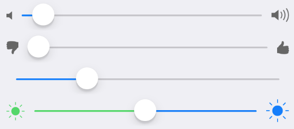
Slider
Slider component.

Example usage:
Theme
Uses following theme properties:
placeholderColor- icons colorprimaryColor- minimum track tint colordividerColor- maximum track tint color
Props
maxIconColor (optional)
type: string
default value: placeholderColor from theme
Color of the maximum track icon (on the right side).
maxIconName (optional)
type: string
Name of the maximum track icon (on the right side).
maxIconSize (optional)
type: number
default value: 35
Size of the maximum track icon (on the right side).
maxTrackTintColor (optional)
type: string
default value: dividerColor from theme
The color used for the track to the right of the button.
maxValue (optional)
type: number
default value: 100
Maximum value of the slider.
minIconColor (optional)
type: string
default value: placeholderColor from theme
Color of the minimum track icon (on the left side).
minIconName (optional)
type: string
Name of the minimum track icon (on the left side).
minIconSize (optional)
type: number
default value: 28
Size of the minimum track icon (on the left side).
minTrackTintColor (optional)
type: string
default value: primaryColor from theme
The color used for the track to the left of the button.
minValue (optional)
type: number
default value: 0
Minimum value of the slider.
onSlidingComplete (optional)
type: (value: number) => void
Callback that is called when the user releases the slider, regardless if the value has changed. The current value is passed as an argument to the callback handler.
onValueChange (optional)
type: (value: number) => void
Invoked with the new value when the value changes.
stepValue (optional)
type: number
default value: 1
Step value of the slider. The value should be between 0 and (maximumValue - minimumValue).
style (optional)
type: Object
Custom styles to apply to the Icon.
theme (optional)
type: Theme
Custom theme for component. By default provided by the ThemeProvider.
value
type: number
Value of the slider.