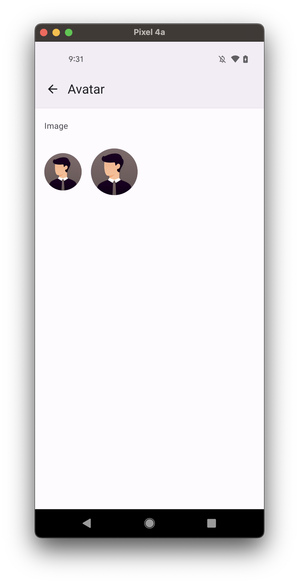
Avatar.Image
Avatars can be used to represent people in a graphical way.
Usage
import * as React from 'react';
import { Avatar } from 'react-native-paper';

const MyComponent = () => (
  <Avatar.Image size={24} source={require('../assets/avatar.png')} />
);
export default MyComponent
Props
source (required)
Type: | ImageSourcePropType
| ((props: { size: number }) => React.ReactNode)
Image to display for the Avatar.
It accepts a standard React Native Image source prop
Or a function that returns an Image.
size
Type: number
Default value: 64
Size of the avatar.
style
Type: StyleProp<ViewStyle>
onError
Type: ImageProps['onError']
Invoked on load error.
onLayout
Type: ImageProps['onLayout']
Invoked on mount and on layout changes.
onLoad
Type: ImageProps['onLoad']
Invoked when load completes successfully.
onLoadEnd
Type: ImageProps['onLoadEnd']
Invoked when load either succeeds or fails.
onLoadStart
Type: ImageProps['onLoadStart']
Invoked on load start.
onProgress
Type: ImageProps['onProgress']
Invoked on download progress.
theme
Type: ThemeProp