TextInput
A component to allow users to input text.
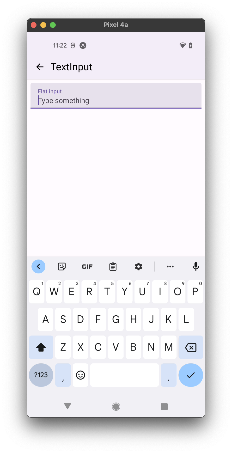
- flat (focused)
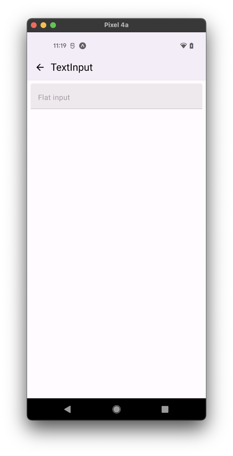
- flat (disabled)
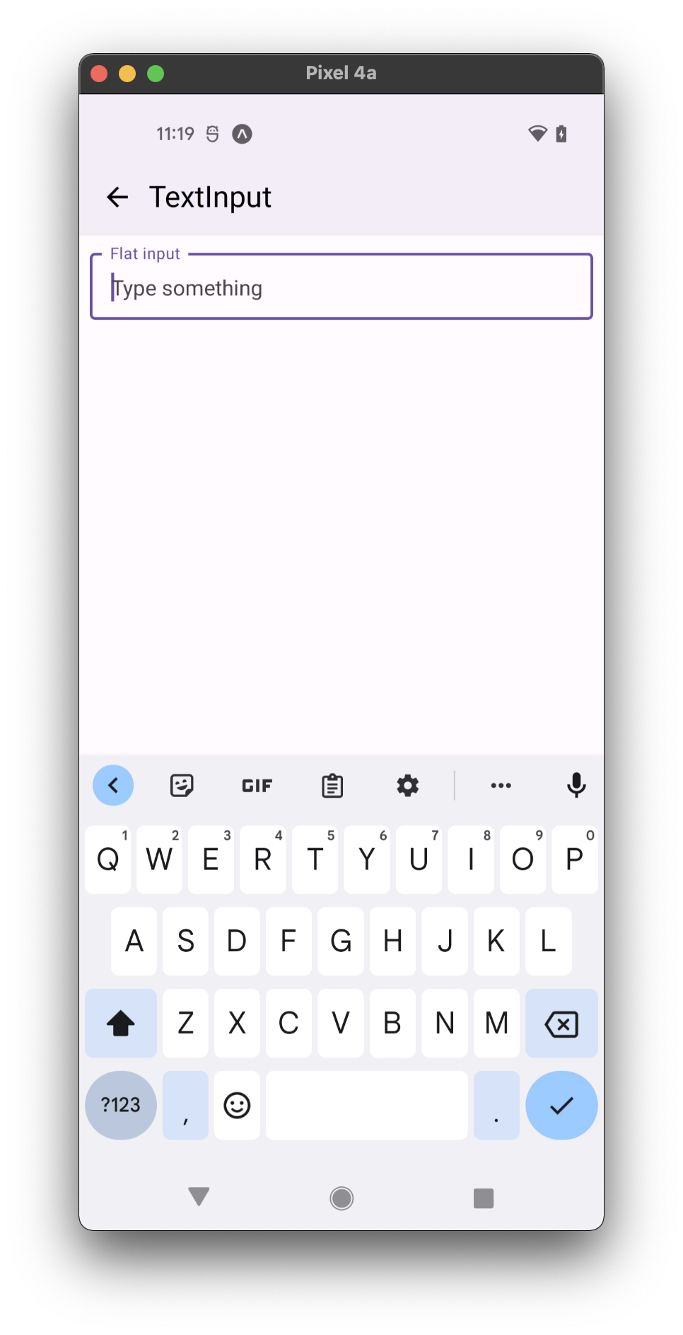
- outlined (focused)
- outlined (disabled)

Usage
import * as React from 'react';
import { TextInput } from 'react-native-paper';

const MyComponent = () => {
  const [text, setText] = React.useState("");

  return (
    <TextInput
      label="Email"
      value={text}
      onChangeText={text => setText(text)}
    />
  );
};

export default MyComponent;
Props
TextInput props
...TextInput propsmode
Type: 'flat' | 'outlined'
Default value: 'flat'
Mode of the TextInput.
flat- flat input with an underline.outlined- input with an outline.
In outlined mode, the background color of the label is derived from colors?.background in theme or the backgroundColor style.
This component render TextInputOutlined or TextInputFlat based on that props
left
Type: React.ReactNode
The adornment placed on the left side of the input. It can be either TextInput.Icon or TextInput.Affix.
right
Type: React.ReactNode
The adornment placed on the right side of the input. It can be either TextInput.Icon or TextInput.Affix.
disabled
Type: boolean
Default value: false
If true, user won't be able to interact with the component.
label
Type: TextInputLabelProp
The text or component to use for the floating label.
placeholder
Type: string
Placeholder for the input.
error
Type: boolean
Default value: false
Whether to style the TextInput with error style.
onChangeText
Type: Function
Callback that is called when the text input's text changes. Changed text is passed as an argument to the callback handler.
selectionColor
Type: string
Selection color of the input. On iOS, it sets both the selection color and cursor color. On Android, it sets only the selection color.
cursorColor Android only
Type: string
Cursor (or "caret") color of the input on Android. This property has no effect on iOS.
underlineColor
Type: string
Inactive underline color of the input.
activeUnderlineColor
Type: string
Active underline color of the input.
outlineColor
Type: string
Inactive outline color of the input.
activeOutlineColor
Type: string
Active outline color of the input.
textColor
Type: string
Color of the text in the input.
dense
Type: boolean
Default value: false
Sets min height with densed layout. For TextInput in flat mode
height is 64dp or in dense layout - 52dp with label or 40dp without label.
For TextInput in outlined mode
height is 56dp or in dense layout - 40dp regardless of label.
When you apply height prop in style the dense prop affects only paddingVertical inside TextInput
multiline
Type: boolean
Default value: false
Whether the input can have multiple lines.
numberOfLines Android only
Type: number
The number of lines to show in the input (Android only).
onFocus
Type: (args: any) => void
Callback that is called when the text input is focused.
onBlur
Type: (args: any) => void
Callback that is called when the text input is blurred.
render
Type: (props: RenderProps) => React.ReactNode
Default value: (props: RenderProps) => <NativeTextInput {...props} />
Callback to render a custom input component such as react-native-text-input-mask
instead of the default TextInput component from react-native.
Example:
<TextInput
  label="Phone number"
  render={props =>
    <TextInputMask
      {...props}
      mask="+[00] [000] [000] [000]"
    />
  }
/>
value
Type: string
Value of the text input.
style
Type: StyleProp<TextStyle>
Pass fontSize prop to modify the font size inside TextInput.
Pass height prop to set TextInput height. When height is passed,
dense prop will affect only input's paddingVertical.
Pass paddingHorizontal to modify horizontal padding.
This can be used to get MD Guidelines v1 TextInput look.
theme
Type: ThemeProp
testID
Type: string
testID to be used on tests.
contentStyle
Type: StyleProp<TextStyle>
Pass custom style directly to the input itself.
Overrides input style
Example: paddingLeft, backgroundColor
outlineStyle
Type: StyleProp<ViewStyle>
Pass style to override the default style of outlined wrapper.
Overrides style when mode is set to outlined
Example: borderRadius, borderColor
underlineStyle
Type: StyleProp<ViewStyle>
Pass style to override the default style of underlined wrapper.
Overrides style when mode is set to flat
Example: borderRadius, borderColor
editable
Type:
Default value: true