TextInput.Icon
A component to render a leading / trailing icon in the TextInput
Usage
import * as React from 'react';
import { TextInput } from 'react-native-paper';
const MyComponent = () => {
const [text, setText] = React.useState('');
return (
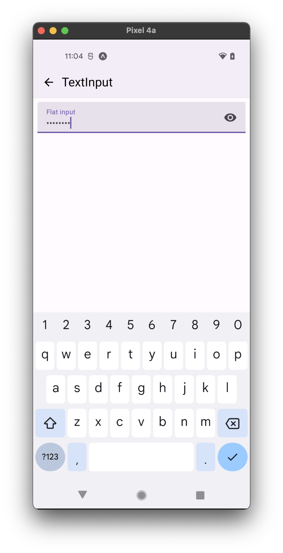
<TextInput
label="Password"
secureTextEntry
right={<TextInput.Icon icon="eye" />}
/>
);
};
export default MyComponent;
Props
icon (required) Renamed from 'name' to 'icon` in v5.x
Type: IconSource
Icon to show.
onPress
Type: (e: GestureResponderEvent) => void
Function to execute on press.
forceTextInputFocus
Type: boolean
Default value: true
Whether the TextInput will focus after onPress.
color
Type: ((isTextInputFocused: boolean) => string | undefined) | string
Color of the icon or a function receiving a boolean indicating whether the TextInput is focused and returning the color.
rippleColor
Type: ColorValue
Color of the ripple effect.
style
Type: StyleProp<ViewStyle>
theme
Type: ThemeProp