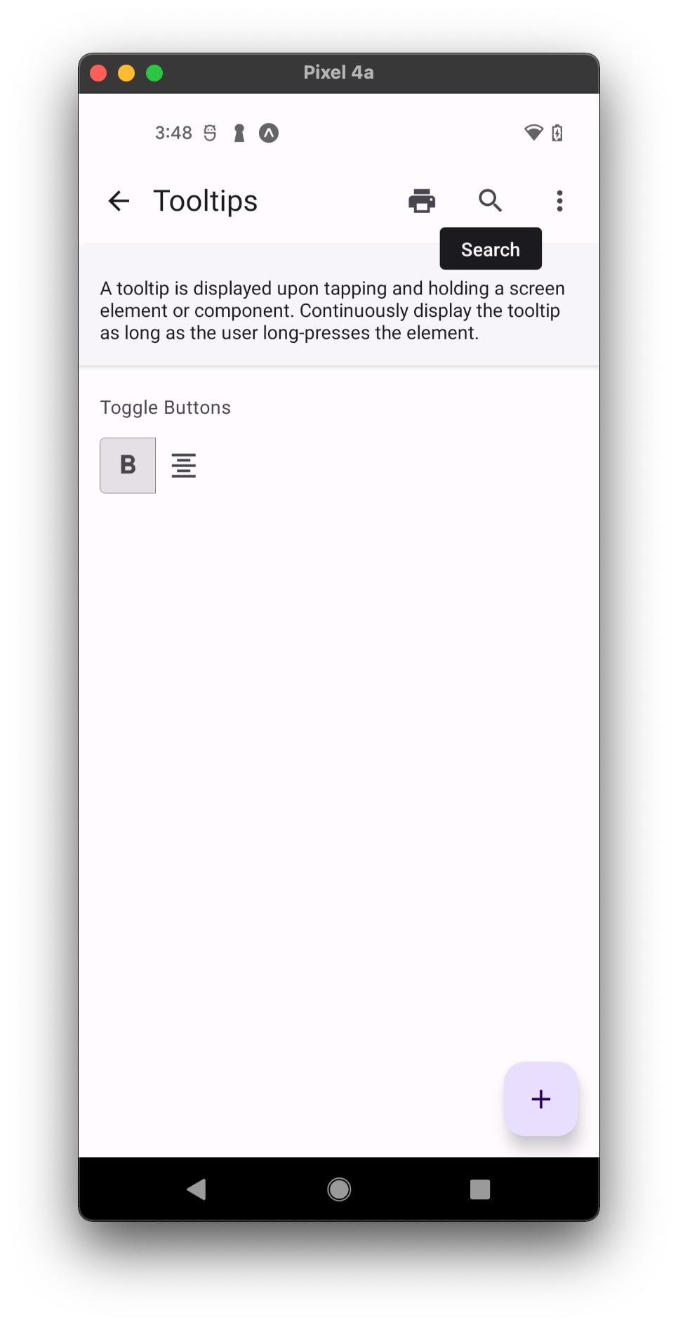
Tooltip
Tooltips display informative text when users hover over, focus on, or tap an element.
Plain tooltips, when activated, display a text label identifying an element, such as a description of its function. Tooltips should include only short, descriptive text and avoid restating visible UI text.

Usage
import * as React from 'react';
import { IconButton, Tooltip } from 'react-native-paper';

const MyComponent = () => (
  <Tooltip title="Selected Camera">
    <IconButton icon="camera" selected size={24} onPress={() => {}} />
  </Tooltip>
);

export default MyComponent;
Props
children (required)
Type: React.ReactElement
Tooltip reference element. Needs to be able to hold a ref.
enterTouchDelay
Type: number
Default value: 500
The number of milliseconds a user must touch the element before showing the tooltip.
leaveTouchDelay
Type: number
Default value: 1500
The number of milliseconds after the user stops touching an element before hiding the tooltip.
title (required)
Type: string
Tooltip title
titleMaxFontSizeMultiplier
Type: number
Specifies the largest possible scale a title font can reach.
theme
Type: ThemeProp
Theme colors
| mode | backgroundColor | textColor |
|---|---|---|
| - | theme.colors.onSurface | theme.colors.surface |
If a dedicated prop for a specific color is not available or the style prop does not allow color modification, you can customize it using the theme prop. It allows to override any color, within the component, based on the table above.
Example of overriding primary color:
<Tooltip theme={{ colors: { primary: 'green' } }} />