Card
A card is a sheet of material that serves as an entry point to more detailed information.
- elevated
- outlined
- contained

Usage
import * as React from 'react';
import { Avatar, Button, Card, Text } from 'react-native-paper';
const LeftContent = props => <Avatar.Icon {...props} icon="folder" />
const MyComponent = () => (
<Card>
<Card.Title title="Card Title" subtitle="Card Subtitle" left={LeftContent} />
<Card.Content>
<Text variant="titleLarge">Card title</Text>
<Text variant="bodyMedium">Card content</Text>
</Card.Content>
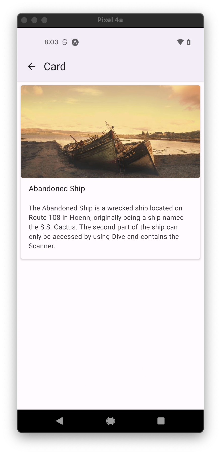
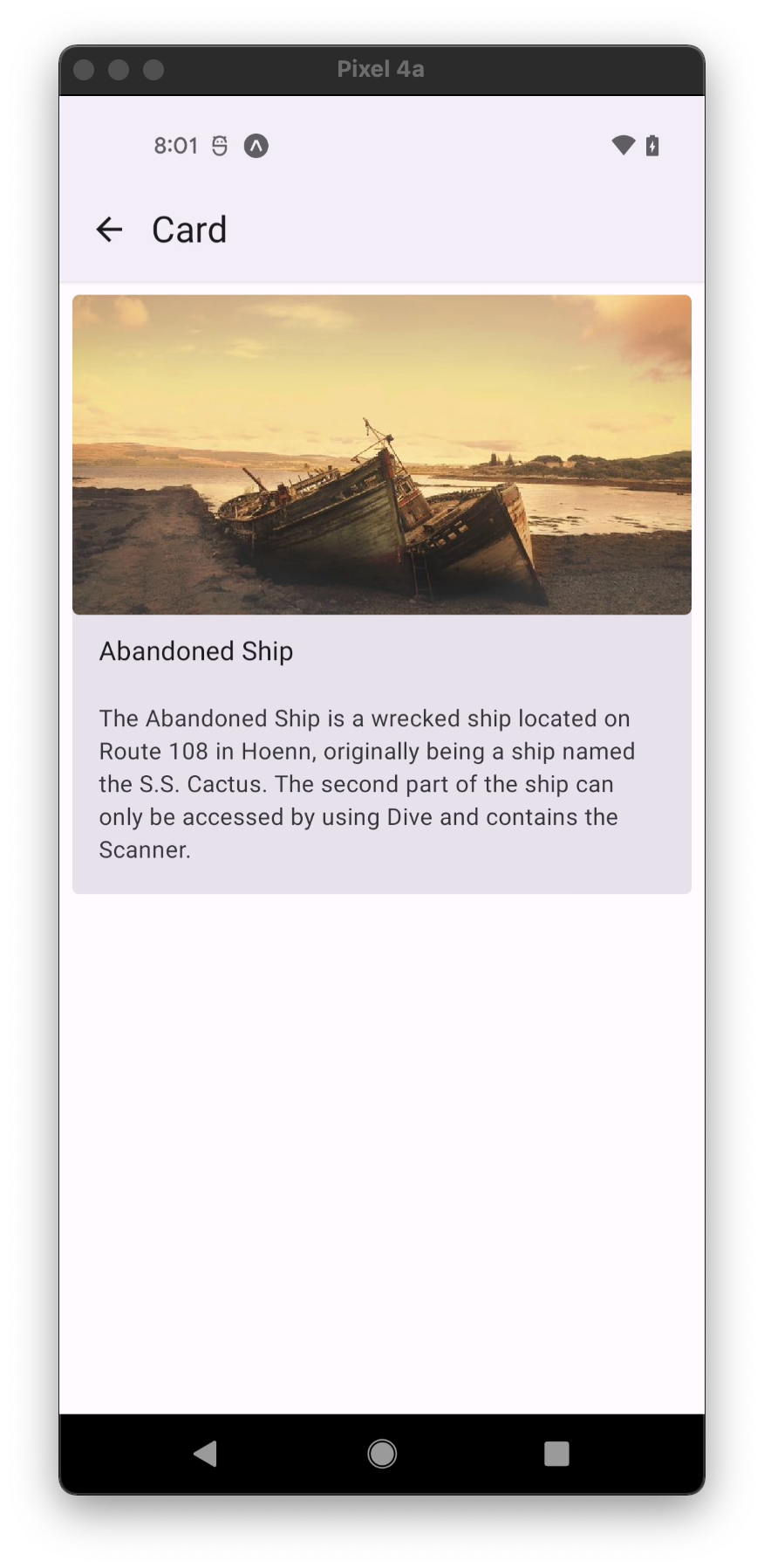
<Card.Cover source={{ uri: 'https://picsum.photos/700' }} />
<Card.Actions>
<Button>Cancel</Button>
<Button>Ok</Button>
</Card.Actions>
</Card>
);
export default MyComponent;
Props
mode
Type: 'elevated' | 'outlined' | 'contained'
Default value: 'elevated'
Mode of the Card.
elevated- Card with elevation.contained- Card without outline and elevation Available in v5.x with theme version 3outlined- Card with an outline.
children (required)
Type: React.ReactNode
Content of the Card.
onLongPress
Type: () => void
Function to execute on long press.
onPress
Type: (e: GestureResponderEvent) => void
Function to execute on press.
onPressIn
Type: (e: GestureResponderEvent) => void
Function to execute as soon as the touchable element is pressed and invoked even before onPress.
onPressOut
Type: (e: GestureResponderEvent) => void
Function to execute as soon as the touch is released even before onPress.
delayLongPress
Type: number
The number of milliseconds a user must touch the element before executing onLongPress.
disabled
Type: boolean
If true, disable all interactions for this component.
elevation
Type: 0 | 1 | 2 | 3 | 4 | 5 | Animated.Value
Default value: 1
Changes Card shadow and background on iOS and Android.
contentStyle
Type: StyleProp<ViewStyle>
Style of card's inner content.
style
Type: Animated.WithAnimatedValue<StyleProp<ViewStyle>>
theme
Type: ThemeProp
testID
Type: string
Default value: 'card'
Pass down testID from card props to touchable
accessible
Type: boolean
Pass down accessible from card props to touchable
Theme colors
| mode | backgroundColor | borderColor |
|---|---|---|
| contained | theme.colors.surfaceVariant | |
| elevated | theme.colors.elevation.level1 | |
| outlined | theme.colors.surface | theme.colors.outline |
If a dedicated prop for a specific color is not available or the style prop does not allow color modification, you can customize it using the theme prop. It allows to override any color, within the component, based on the table above.
Example of overriding primary color:
<Card theme={{ colors: { primary: 'green' } }} />