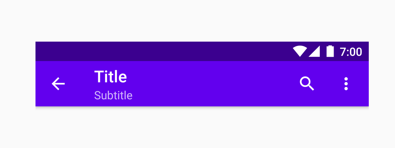
Appbar.Header
A component to use as a header at the top of the screen. It can contain the screen title, controls such as navigation buttons, menu button etc.
Usage
import * as React from 'react';
import { Appbar } from 'react-native-paper';

const MyComponent = () => {
  const _goBack = () => console.log('Went back');

  const _handleSearch = () => console.log('Searching');

  const _handleMore = () => console.log('Shown more');

  return (
    <Appbar.Header>
      <Appbar.BackAction onPress={_goBack} />
      <Appbar.Content title="Title" subtitle="Subtitle" />
      <Appbar.Action icon="magnify" onPress={_handleSearch} />
      <Appbar.Action icon="dots-vertical" onPress={_handleMore} />
    </Appbar.Header>
  );
};

export default MyComponent;
Props
darkType:
booleanWhether the background color is a dark color. A dark header will render light text and vice-versa.
statusBarHeightType:
numberExtra padding to add at the top of header to account for translucent status bar.
This is automatically handled on iOS >= 11 including iPhone X using SafeAreaView.
If you are using Expo, we assume translucent status bar and set a height for status bar automatically.
Pass 0 or a custom value to disable the default behaviour, and customize the height.
themeType:
ReactNativePaper.ThemestyleType:
StyleProp<ViewStyle>