Theming with React Navigation
In this guide we will look into how to apply theming for an application using React Native Paper and React Navigation at the same time.
Offering different theme options, especially dark/light ones, becomes increasingly a standard requirement of the modern mobile application. Fortunately, both React Navigation and React Native Paper support configurable theming out-of-the-box. But how to make them work together?
Combining theme objects
Both libraries require a wrapper to be used at the entry point of the application.
React Navigation exposes NavigationContainer which ensures that navigation works correctly, but also accepts theme as an optional property. Read more about setting up navigation here.
For React Native Paper theme to work, we need to use PaperProvider also at application's entry point.
import { NavigationContainer } from '@react-navigation/native';
import { createStackNavigator } from '@react-navigation/stack';
import { TouchableOpacity } from 'react-native';
import {
  Card,
  Title,
  Paragraph,
  List,
  Provider as PaperProvider,
} from 'react-native-paper';

const Stack = createStackNavigator();

const HomeScreen = ({ navigation }) => (
  <TouchableOpacity
    onPress={() =>
      navigation?.push('Details', {
        title,
        content,
      })
    }
  >
    <Card>
      <Card.Content>
        <Title>{title}</Title>
        <Paragraph>{content}</Paragraph>
      </Card.Content>
    </Card>
  </TouchableOpacity>
);

const DetailsScreen = (props) => {
  const { title, content } = props?.route?.params;
  return (
    <List.Section>
      <List.Subheader>{title}</List.Subheader>
      <List.Item title={content} />
    </List.Section>
  );
};

export default function App() {
  return (
    <PaperProvider>
      <NavigationContainer>
        <Stack.Navigator initialRouteName="Home">
          <Stack.Screen name="Home" component={HomeScreen} />
          <Stack.Screen name="Details" component={DetailsScreen} />
        </Stack.Navigator>
      </NavigationContainer>
    </PaperProvider>
  );
}
Fortunately, both React Navigation and React Native Paper offer very similar API when it comes to theming. It's possible to import default themes in light and dark variants from both.
React Navigation and React Native Paper use the same name for default themes - DefaultTheme and DarkTheme, so we need to alias them at the imports.
Our goal here is to combine those two themes, so that we could control the theme for the entire application from a single place.
To make things easier we can use deepmerge package. With yarn we can install it like this
yarn add deepmergeimport {
NavigationContainer,
DarkTheme as NavigationDarkTheme,
DefaultTheme as NavigationDefaultTheme,
} from '@react-navigation/native';
import {
DarkTheme as PaperDarkTheme,
DefaultTheme as PaperDefaultTheme,
Provider as PaperProvider,
} from 'react-native-paper';
import merge from 'deepmerge';
const CombinedDefaultTheme = merge(PaperDefaultTheme, NavigationDefaultTheme);
const CombinedDarkTheme = merge(PaperDarkTheme, NavigationDarkTheme);Alternatively, we could merge those themes using vanilla JavaScript
const CombinedDefaultTheme = {
  ...PaperDefaultTheme,
  ...NavigationDefaultTheme,
  colors: {
    ...PaperDefaultTheme.colors,
    ...NavigationDefaultTheme.colors,
  },
};
const CombinedDarkTheme = {
  ...PaperDarkTheme,
  ...NavigationDarkTheme,
  colors: {
    ...PaperDarkTheme.colors,
    ...NavigationDarkTheme.colors,
  },
};
Passing theme with Providers
After combining the themes, we will be able to control theming in both libraries from a single source, which will come in handy later.
Next, we need to pass merged themes into the Providers. For this part, we use the dark one - CombinedDarkTheme.
const CombinedDefaultTheme = merge(PaperDefaultTheme, NavigationDefaultTheme);
const CombinedDarkTheme = merge(PaperDarkTheme, NavigationDarkTheme);

const Stack = createStackNavigator();

export default function App() {
  return (
    <PaperProvider theme={CombinedDarkTheme}>
      <NavigationContainer theme={CombinedDarkTheme}>
        <Stack.Navigator initialRouteName="Home">
          <Stack.Screen name="Home" component={HomeScreen} />
          <Stack.Screen name="Details" component={DetailsScreen} />
        </Stack.Navigator>
      </NavigationContainer>
    </PaperProvider>
  );
}
Customizing theme
We don't need to limit ourselves to the themes offered by the libraries in default. Both packages allow for custom themes to be applied. You can learn all about it their documentations:
React Context for theme customization
Now, we wouldn't want to stay forever with dark theme being on, which is why we need to gain the ability to control theme dynamically. A bit of state management is needed for this purpose.
React Context proves itself very useful in handling cross-cutting concerns like global theme handling, so we will use just that.
Creating Context
First, we define our Context.
import React from 'react';

export const PreferencesContext = React.createContext({
  toggleTheme: () => {},
  isThemeDark: false,
});
Using Context
Context Provider should be imported also at the entry point, as we want it to wrap the whole app, for the theme values to be accessible at every component that we have.
import React from 'react';
import { PreferencesContext } from './PreferencesContext';

const Stack = createStackNavigator();

const CombinedDefaultTheme = merge(PaperDefaultTheme, NavigationDefaultTheme);
const CombinedDarkTheme = merge(PaperDarkTheme, NavigationDarkTheme);

export default function App() {
  const [isThemeDark, setIsThemeDark] = React.useState(false);

  let theme = isThemeDark ? CombinedDarkTheme : CombinedDefaultTheme;

  const toggleTheme = React.useCallback(() => {
    return setIsThemeDark(!isThemeDark);
  }, [isThemeDark]);

  const preferences = React.useMemo(
    () => ({
      toggleTheme,
      isThemeDark,
    }),
    [toggleTheme, isThemeDark]
  );

  return (
    // Context is wired into the local state of our main component, so that its values could be propagated throughout the entire application
    <PreferencesContext.Provider value={preferences}>
      <PaperProvider theme={theme}>
        <NavigationContainer theme={theme}>
          <Stack.Navigator initialRouteName="Home">
            <Stack.Screen name="Home" component={HomeScreen} />
            <Stack.Screen name="Details" component={DetailsScreen} />
          </Stack.Navigator>
        </NavigationContainer>
      </PaperProvider>
    </PreferencesContext.Provider>
  );
}
Now that the Context is available at every component, all we need to do is import it. Next thing is to provide the user with some UI element to control changing the theme. We will use Paper's Switch for this purpose.
import React from 'react';
import { useTheme, Appbar, TouchableRipple, Switch } from 'react-native-paper';
import { PreferencesContext } from './PreferencesContext';

const Header = ({ scene }) => {
  const theme = useTheme();
  const { toggleTheme, isThemeDark } = React.useContext(PreferencesContext);

  return (
    <Appbar.Header
      theme={{
        colors: {
          primary: theme?.colors.surface,
        },
      }}
    >
      <Appbar.Content title={scene.route?.name} />
      <TouchableRipple onPress={() => toggleTheme()}>
        <Switch
          style={[{ backgroundColor: theme.colors.accent }]}
          color={'red'}
          value={isThemeDark}
        />
      </TouchableRipple>
    </Appbar.Header>
  );
};
And now you can switch between light and dark theme!
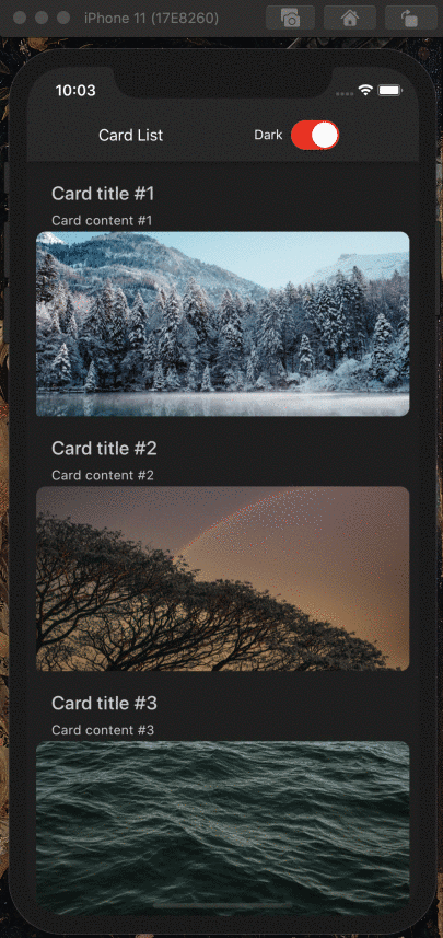
Thanks to the linking of themes that we did earlier, switching themes can be controlled with only one piece of state.
React Native Paper components will automatically use provided theme thanks to the PaperProvider that is wrapped around the entry point of our application, but we can also access theme values manually with useTheme hook,
exposed by the library. You can see how it's done in the Header component code above.
If light/dark themes are not enough for your use case, you can learn more about creating Material Design themes here.
On main branch of the example app, you will find implemented Menu component, which allows to choose a few custom themes. Inspecting code in utils and Header may give you some idea how to use your own themes with Paper, in addition to dedicated docs.
Read more about integrating Paper with React Navigation in a brilliant article by @trensik