RadioButton
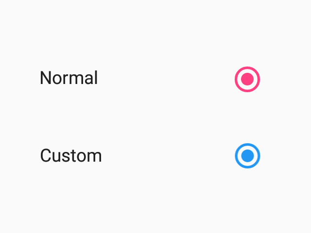
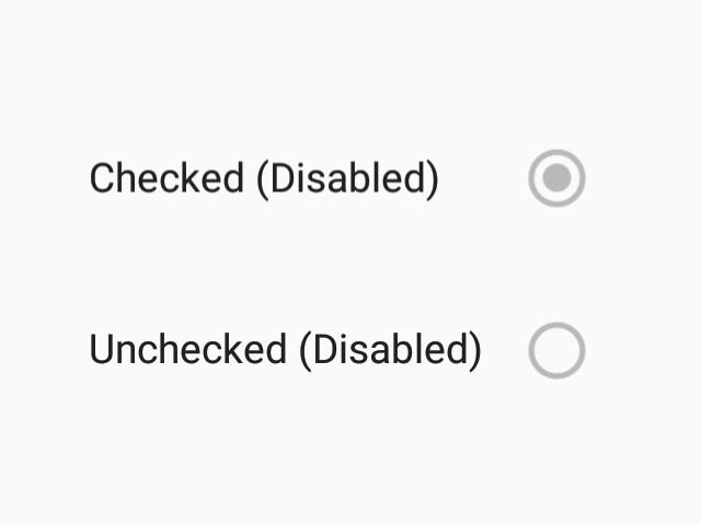
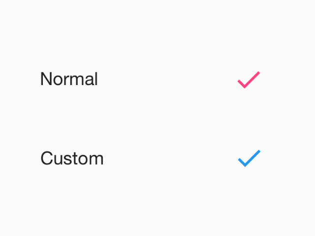
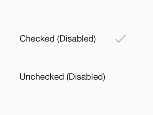
Radio buttons allow the selection a single option from a set.
Usage
import * as React from 'react';
import { View } from 'react-native';
import { RadioButton } from 'react-native-paper';

const MyComponent = () => {
  const [checked, setChecked] = React.useState('first');

  return (
    <View>
      <RadioButton
        value="first"
        status={ checked === 'first' ? 'checked' : 'unchecked' }
        onPress={() => setChecked('first')}
      />
      <RadioButton
        value="second"
        status={ checked === 'second' ? 'checked' : 'unchecked' }
        onPress={() => setChecked('second')}
      />
    </View>
  );
};

export default MyComponent;
Props
themeType:
ReactNativePaper.Theme