FAB.Group
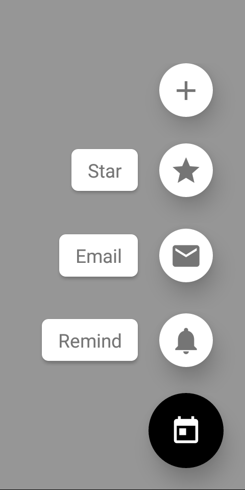
A component to display a stack of FABs with related actions in a speed dial.
To render the group above other components, you'll need to wrap it with the Portal component.
Usage
import * as React from 'react';
import { FAB, Portal, Provider } from 'react-native-paper';

const MyComponent = () => {
  const [state, setState] = React.useState({ open: false });

  const onStateChange = ({ open }) => setState({ open });

  const { open } = state;

  return (
    <Provider>
      <Portal>
        <FAB.Group
          open={open}
          icon={open ? 'calendar-today' : 'plus'}
          actions={[
            { icon: 'plus', onPress: () => console.log('Pressed add') },
            {
              icon: 'star',
              label: 'Star',
              onPress: () => console.log('Pressed star'),
            },
            {
              icon: 'email',
              label: 'Email',
              onPress: () => console.log('Pressed email'),
            },
            {
              icon: 'bell',
              label: 'Remind',
              onPress: () => console.log('Pressed notifications'),
              small: false,
            },
          ]}
          onStateChange={onStateChange}
          onPress={() => {
            if (open) {
              // do something if the speed dial is open
            }
          }}
        />
      </Portal>
    </Provider>
  );
};

export default MyComponent;
Props
actions (required)Array<{
icon: IconSource;
label?: string;
color?: string;
labelTextColor?: string;
accessibilityLabel?: string;
style?: StyleProp<ViewStyle>;
labelStyle?: StyleProp<ViewStyle>;
small?: boolean;
onPress: () => void;
testID?: string;
}>Action items to display in the form of a speed dial. An action item should contain the following properties:
icon: icon to display (required)label: optional label textaccessibilityLabel: accessibility label for the action, uses label by default if specifiedcolor: custom icon color of the action itemlabelTextColor: custom label text color of the action itemstyle: pass additional styles for the fab item, for example,backgroundColorlabelStyle: pass additional styles for the fab item label, for example,backgroundColorsmall: boolean describing whether small or normal sized FAB is rendered. Defaults totrueonPress: callback that is called whenFABis pressed (required)
icon (required)IconSourceIcon to display for the FAB.
You can toggle it based on whether the speed dial is open to display a different icon.
accessibilityLabelstringAccessibility label for the FAB. This is read by the screen reader when the user taps the FAB.
onStateChange (required)(state: { open: boolean }) => voidCallback which is called on opening and closing the speed dial. The open state needs to be updated when it's called, otherwise the change is dropped.
styleStyleProp<ViewStyle>Style for the group. You can use it to pass additional styles if you need. For example, you can set an additional padding if you have a tab bar at the bottom.
fabStyleStyleProp<ViewStyle>Style for the FAB. It allows to pass the FAB button styles, such as backgroundColor.
themeReactNativePaper.Theme