Button
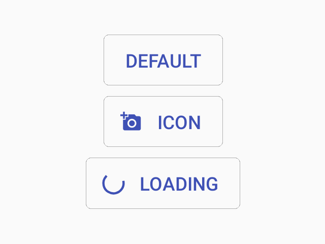
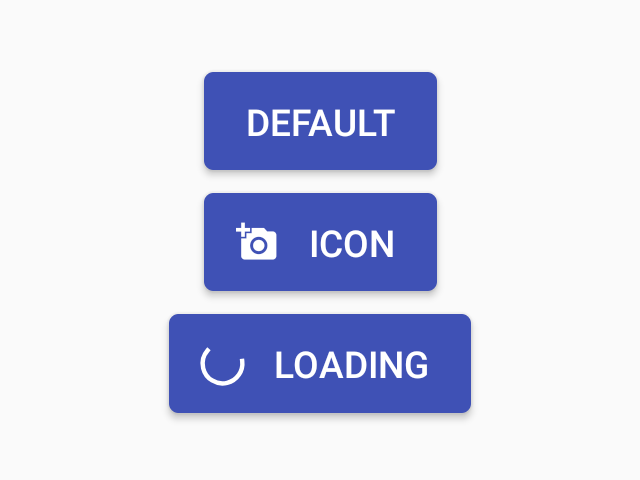
A button is component that the user can press to trigger an action.

Usage
import * as React from 'react';
import { Button } from 'react-native-paper';

const MyComponent = () => (
  <Button icon="camera" mode="contained" onPress={() => console.log('Pressed')}>
    Press me
  </Button>
);

export default MyComponent;
Props
mode'text' | 'outlined' | 'contained''text'Mode of the button. You can change the mode to adjust the styling to give it desired emphasis.
text- flat button without background or outline (low emphasis)outlined- button with an outline (medium emphasis)contained- button with a background color and elevation shadow (high emphasis)
darkbooleanWhether the color is a dark color. A dark button will render light text and vice-versa. Only applicable for contained mode.
disabledbooleanWhether the button is disabled. A disabled button is greyed out and onPress is not called on touch.
uppercasebooleantrueMake the label text uppercased. Note that this won't work if you pass React elements as children.
accessibilityLabelstringAccessibility label for the button. This is read by the screen reader when the user taps the button.
accessibilityHintstringAccessibility hint for the button. This is read by the screen reader when the user taps the button.
contentStyleStyleProp<ViewStyle>Style of button's inner content.
Use this prop to apply custom height and width and to set the icon on the right with flexDirection: 'row-reverse'.
styleStyleProp<ViewStyle>themeReactNativePaper.Theme