RadioButton.Android
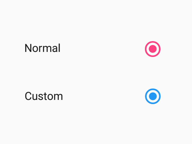
Radio buttons allow the selection a single option from a set. This component follows platform guidelines for Android, but can be used on any platform.

Props
themeType:
ReactNativePaper.ThemeRadio buttons allow the selection a single option from a set. This component follows platform guidelines for Android, but can be used on any platform.
themeReactNativePaper.Theme