Checkbox.IOS
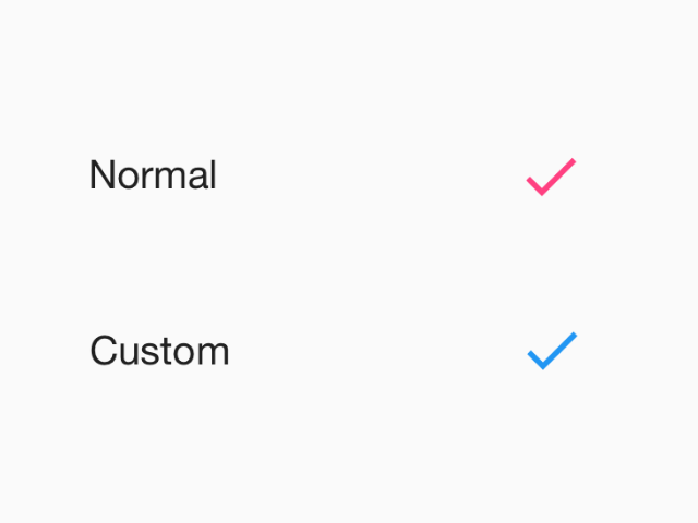
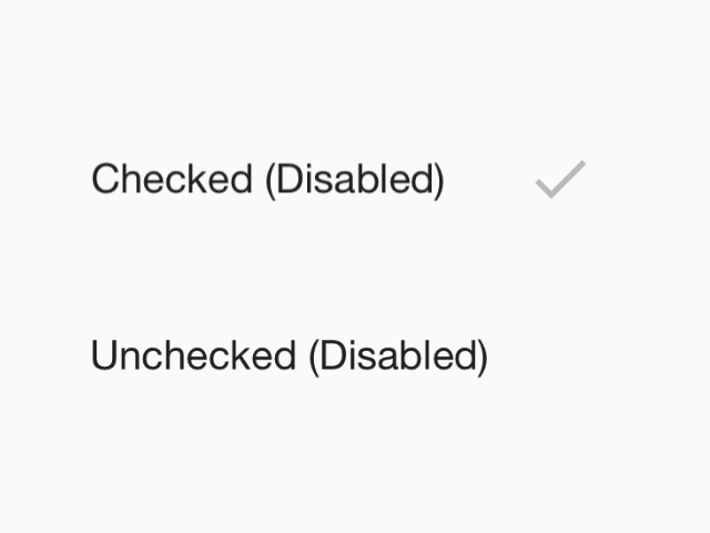
Checkboxes allow the selection of multiple options from a set. This component follows platform guidelines for iOS, but can be used on any platform.
Props
themeType:
ReactNativePaper.ThemeCheckboxes allow the selection of multiple options from a set. This component follows platform guidelines for iOS, but can be used on any platform.
themeReactNativePaper.Theme