TouchableRipple
A wrapper for views that should respond to touches. Provides a material "ink ripple" interaction effect for supported platforms (>= Android Lollipop). On unsupported platforms, it falls back to a highlight effect.
Usage
import * as React from 'react';
import { View } from 'react-native';
import { Text, TouchableRipple } from 'react-native-paper';
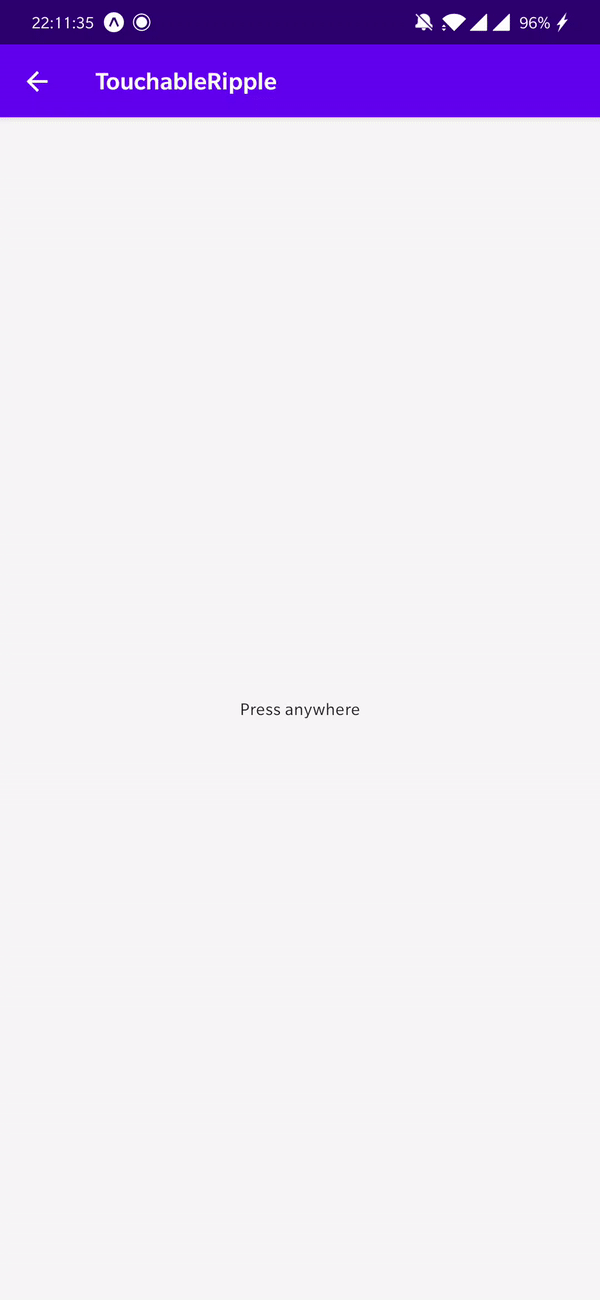
const MyComponent = () => (
<TouchableRipple
onPress={() => console.log('Pressed')}
rippleColor="rgba(0, 0, 0, .32)"
>
<Text>Press anywhere</Text>
</TouchableRipple>
);
export default MyComponent;Props
backgroundType:
ObjectType of background drawabale to display the feedback (Android). https://reactnative.dev/docs/touchablenativefeedback#background
onPressType:
(e: GestureResponderEvent) => voidFunction to execute on press. If not set, will cause the touchable to be disabled.
styleType:
StyleProp<ViewStyle>themeType:
ReactNativePaper.Theme...TouchableWithoutFeedback propsEdit this page