Menu
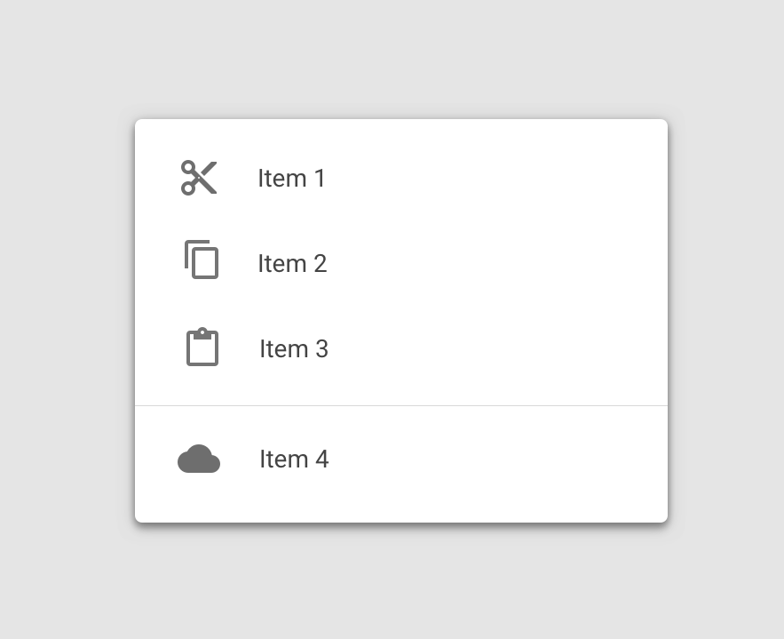
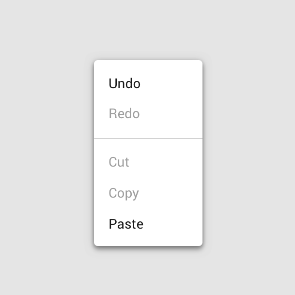
Menus display a list of choices on temporary elevated surfaces. Their placement varies based on the element that opens them.
Usage
import * as React from 'react';
import { View } from 'react-native';
import { Button, Menu, Divider, Provider } from 'react-native-paper';

const MyComponent = () => {
  const [visible, setVisible] = React.useState(false);

  const openMenu = () => setVisible(true);

  const closeMenu = () => setVisible(false);

  return (
    <Provider>
      <View
        style={{
          paddingTop: 50,
          flexDirection: 'row',
          justifyContent: 'center',
        }}>
        <Menu
          visible={visible}
          onDismiss={closeMenu}
          anchor={<Button onPress={openMenu}>Show menu</Button>}>
          <Menu.Item onPress={() => {}} title="Item 1" />
          <Menu.Item onPress={() => {}} title="Item 2" />
          <Divider />
          <Menu.Item onPress={() => {}} title="Item 3" />
        </Menu>
      </View>
    </Provider>
  );
};

export default MyComponent;
Props
anchor (required)React.ReactNode | { x: number; y: number }The anchor to open the menu from. In most cases, it will be a button that opens the menu.
statusBarHeightnumberAPPROX_STATUSBAR_HEIGHTExtra margin to add at the top of the menu to account for translucent status bar on Android.
If you are using Expo, we assume translucent status bar and set a height for status bar automatically.
Pass 0 or a custom value to and customize it.
This is automatically handled on iOS.
onDismiss (required)() => voidCallback called when Menu is dismissed. The visible prop needs to be updated when this is called.
overlayAccessibilityLabelstring'Close menu'Accessibility label for the overlay. This is read by the screen reader when the user taps outside the menu.
styleStyleProp<ViewStyle>themeReactNativePaper.ThemeStatic properties
These properties can be accessed on Menu by using the dot notation, e.g. Menu.Item.
Itemstatic