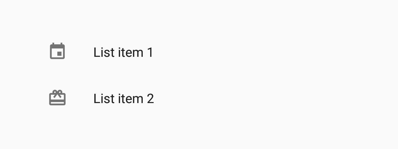
List.Item
A component to show tiles inside a List.
Usage
import * as React from 'react';
import { List } from 'react-native-paper';
const MyComponent = () => (
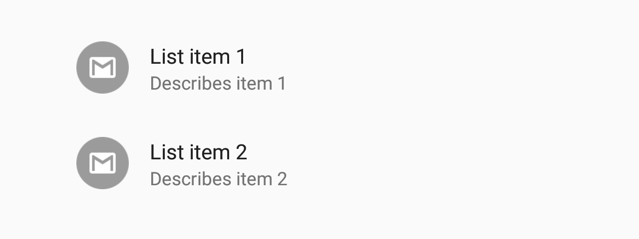
<List.Item
title="First Item"
description="Item description"
left={props => <List.Icon {...props} icon="folder" />}
/>
);
export default MyComponent;Props
title (required)Type:
React.ReactNode
| ((props: {
selectable: boolean;
ellipsizeMode: EllipsizeProp | undefined;
color: string;
fontSize: number;
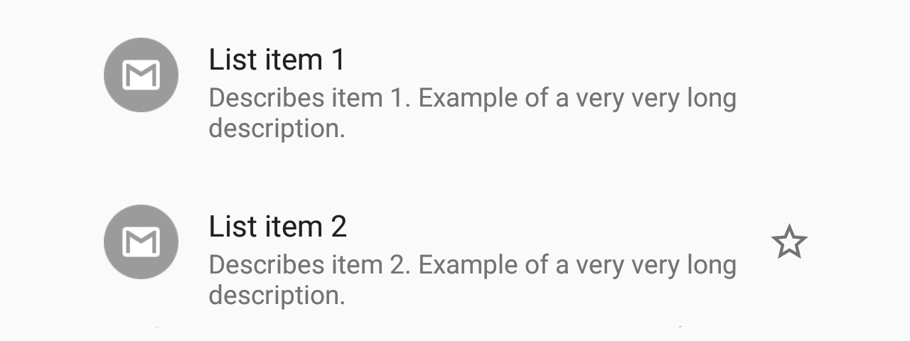
}) => React.ReactNode)Title text for the list item.
descriptionType:
React.ReactNode
| ((props: {
    selectable: boolean;
    ellipsizeMode: EllipsizeProp | undefined;
    color: string;
    fontSize: number;
  }) => React.ReactNode)
Description text for the list item or callback which returns a React element to display the description.
leftType:
(props: {
  color: string;
  style: {
    marginLeft: number;
    marginRight: number;
    marginVertical?: number;
  };
}) => React.ReactNode
Callback which returns a React element to display on the left side.
rightType:
(props: {
  color: string;
  style?: {
    marginRight: number;
    marginVertical?: number;
  };
}) => React.ReactNode
Callback which returns a React element to display on the right side.
themeType:
ReactNativePaper.ThemetitleNumberOfLinesType:
numberDefault value:
1Truncate Title text such that the total number of lines does not exceed this number.
descriptionNumberOfLinesType:
numberDefault value:
2Truncate Description text such that the total number of lines does not exceed this number.
titleEllipsizeModeType:
EllipsizePropEllipsize Mode for the Title. One of 'head', 'middle', 'tail', 'clip'.
See ellipsizeMode
descriptionEllipsizeModeType:
EllipsizePropEllipsize Mode for the Description. One of 'head', 'middle', 'tail', 'clip'.
See ellipsizeMode
...TouchableRipple propsEdit this page