RadioButton.Item
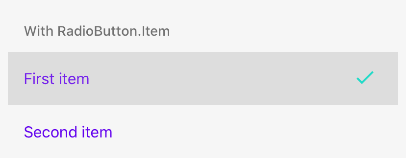
RadioButton.Item allows you to press the whole row (item) instead of only the RadioButton.
Usage
import * as React from 'react';
import { RadioButton } from 'react-native-paper';

const MyComponent = () => {
  const [value, setValue] = React.useState('first');

  return (
    <RadioButton.Group onValueChange={value => setValue(value)} value={value}>
      <RadioButton.Item label="First item" value="first" />
      <RadioButton.Item label="Second item" value="second" />
    </RadioButton.Group>
  );
};

export default MyComponent;
Props
accessibilityLabelType:
stringAccessibility label for the touchable. This is read by the screen reader when the user taps the touchable.
themeType:
ReactNativePaper.ThememodeType:
'android' | 'ios'Whether <RadioButton.Android /> or <RadioButton.IOS /> should be used.
Left undefined <RadioButton /> will be used.