Searchbar
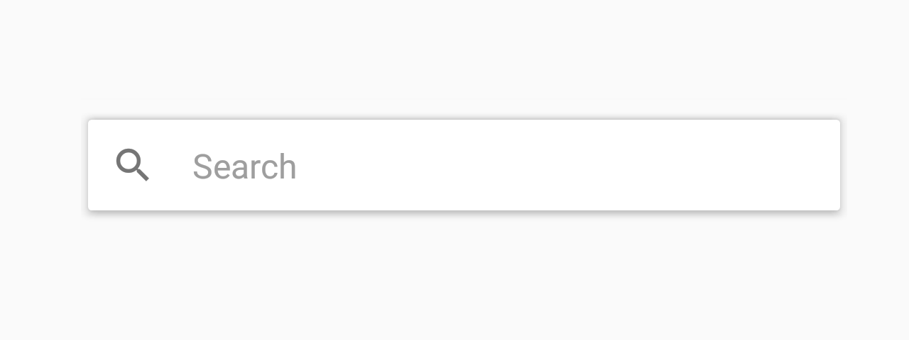
Searchbar is a simple input box where users can type search queries.
Usage
import * as React from 'react';
import { Searchbar } from 'react-native-paper';

const MyComponent = () => {
  const [searchQuery, setSearchQuery] = React.useState('');

  const onChangeSearch = query => setSearchQuery(query);

  return (
    <Searchbar
      placeholder="Search"
      onChangeText={onChangeSearch}
      value={searchQuery}
    />
  );
};

export default MyComponent;
Props
clearAccessibilityLabelType:
stringDefault value:
'clear'Accessibility label for the button. This is read by the screen reader when the user taps the button.
searchAccessibilityLabelType:
stringDefault value:
'search'Accessibility label for the button. This is read by the screen reader when the user taps the button.
onChangeTextType:
(query: string) => voidCallback that is called when the text input's text changes.
styleType:
StyleProp<ViewStyle>themeType:
ReactNativePaper.Theme