TextInput
A component to allow users to input text.
Usage
import * as React from 'react';
import { TextInput } from 'react-native-paper';

const MyComponent = () => {
  const [text, setText] = React.useState("");

  return (
    <TextInput
      label="Email"
      value={text}
      onChangeText={text => setText(text)}
    />
  );
};

export default MyComponent;
Props
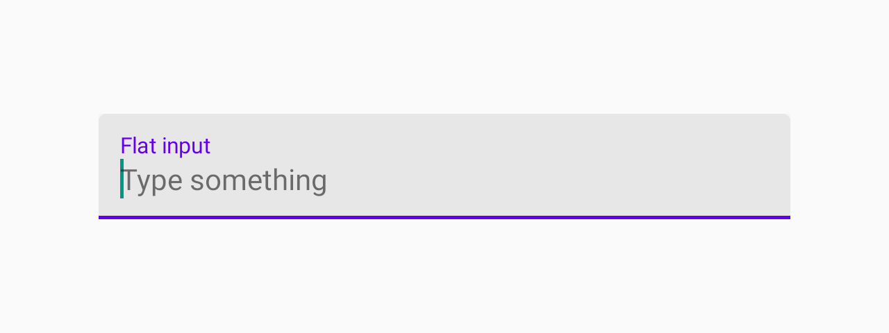
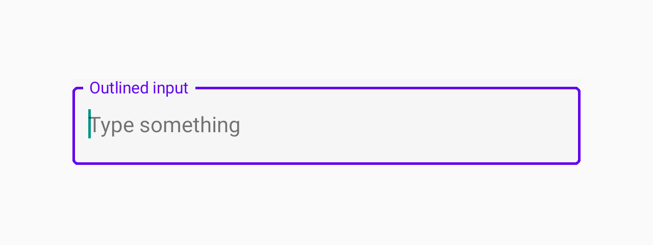
mode'flat' | 'outlined''flat'Mode of the TextInput.
flat- flat input with an underline.outlined- input with an outline.
In outlined mode, the background color of the label is derived from colors.background in theme or the backgroundColor style.
This component render TextInputOutlined or TextInputFlat based on that props
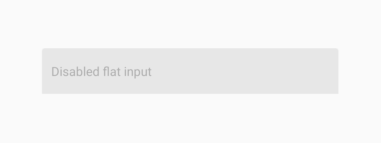
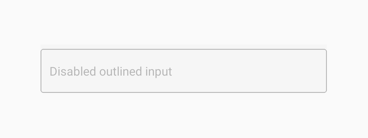
leftReact.ReactNoderightReact.ReactNodedisabledbooleanfalseIf true, user won't be able to interact with the component.
onChangeTextFunctionCallback that is called when the text input's text changes. Changed text is passed as an argument to the callback handler.
densebooleanfalseSets min height with densed layout. For TextInput in flat mode
height is 64dp or in dense layout - 52dp with label or 40dp without label.
For TextInput in outlined mode
height is 56dp or in dense layout - 40dp regardless of label.
When you apply height prop in style the dense prop affects only paddingVertical inside TextInput
render(props: RenderProps) => React.ReactNode(props: RenderProps) => <NativeTextInput {...props} />Callback to render a custom input component such as react-native-text-input-mask
instead of the default TextInput component from react-native.
Example:
<TextInput
  label="Phone number"
  render={props =>
    <TextInputMask
      {...props}
      mask="+[00] [000] [000] [000]"
    />
  }
/>styleStyleProp<TextStyle>Pass fontSize prop to modify the font size inside TextInput.
Pass height prop to set TextInput height. When height is passed,
dense prop will affect only input's paddingVertical.
Pass paddingHorizontal to modify horizontal padding.
This can be used to get MD Guidelines v1 TextInput look.
themeReactNativePaper.Themeeditabletrue...TextInput propsEdit this page