TextInput.Icon
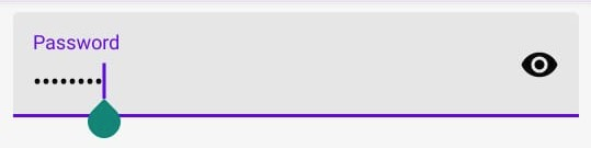
A component to render a leading / trailing icon in the TextInput
Usage
import * as React from 'react';
import { TextInput } from 'react-native-paper';

const MyComponent = () => {
  const [text, setText] = React.useState('');

  return (
    <TextInput
      label="Password"
      secureTextEntry
      right={<TextInput.Icon name="eye" />}
    />
  );
};

export default MyComponent;
Props
colorType:
((isTextInputFocused: boolean) => string | undefined) | stringColor of the icon or a function receiving a boolean indicating whether the TextInput is focused and returning the color.
styleType:
StyleProp<ViewStyle>themeType:
ReactNativePaper.Theme