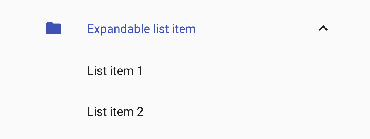
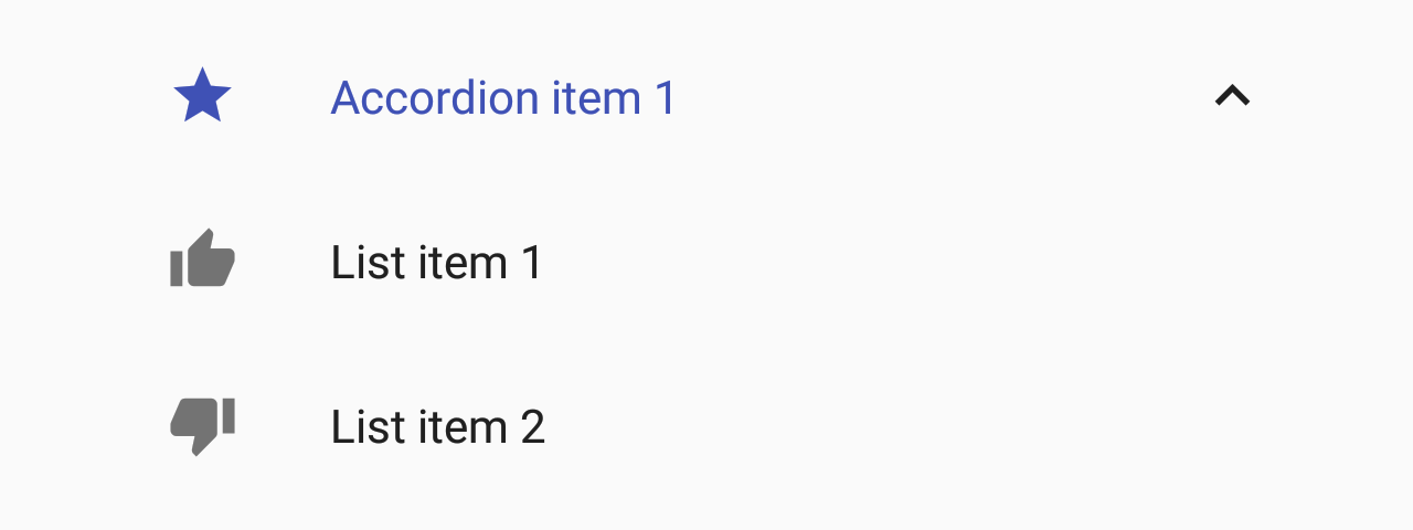
List.Accordion
A component used to display an expandable list item.
Usage
import * as React from 'react';
import { List } from 'react-native-paper';

const MyComponent = () => {
  const [expanded, setExpanded] = React.useState(true);

  const handlePress = () => setExpanded(!expanded);

  return (
    <List.Section title="Accordions">
      <List.Accordion
        title="Uncontrolled Accordion"
        left={props => <List.Icon {...props} icon="folder" />}>
        <List.Item title="First item" />
        <List.Item title="Second item" />
      </List.Accordion>

      <List.Accordion
        title="Controlled Accordion"
        left={props => <List.Icon {...props} icon="folder" />}
        expanded={expanded}
        onPress={handlePress}>
        <List.Item title="First item" />
        <List.Item title="Second item" />
      </List.Accordion>
    </List.Section>
  );
};

export default MyComponent;
Props
left(props: { color: string }) => React.ReactNodeCallback which returns a React element to display on the left side.
right(props: { isExpanded: boolean }) => React.ReactNodeCallback which returns a React element to display on the right side.
expandedbooleanWhether the accordion is expanded
If this prop is provided, the accordion will behave as a "controlled component".
You'll need to update this prop when you want to toggle the component or on onPress.
themeReactNativePaper.ThemetitleNumberOfLinesnumber1Truncate Title text such that the total number of lines does not exceed this number.
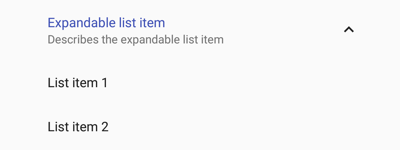
descriptionNumberOfLinesnumber2Truncate Description text such that the total number of lines does not exceed this number.
idstring | numberId is used for distinguishing specific accordion when using List.AccordionGroup. Property is required when using List.AccordionGroup and has no impact on behavior when using standalone List.Accordion.
accessibilityLabelstringAccessibility label for the TouchableRipple. This is read by the screen reader when the user taps the touchable.